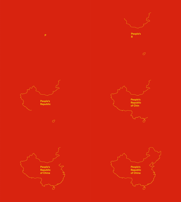
Data Noise
Elephant and woodpecker escaping London zoo
One of my starting thoughts was on the human interpretation of sound, and how as individuals we each have our own perception and thus experience, which could be quantified and told through a story. This concept was developed in one of the sound workshops.

Using the collection of LCC sounds from the studio workshop, Luke and I compiled then into a story based on alternative things these sounds could have been. The resulting story, requiring explaining, is an elephant escaping London Zoo and visiting Big Ben.
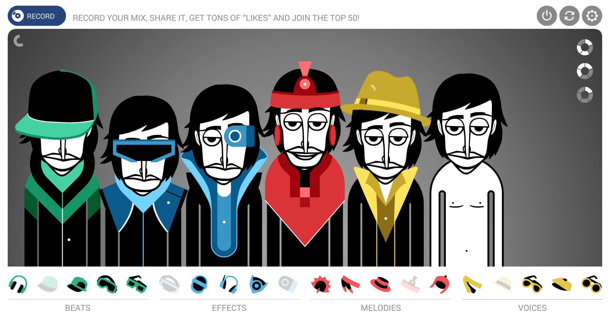
This instrument defines pre-set sounds that can be allocated to pre-set timings. Each person has a tempo and pause, which can be used in tandem with the instruments to control the repetition of each instrument. The piece can also be recorded and played back in this tool, defining this as a true creation and recording tool.
By abstracting sounds away from technical or musical jargon, they make on-boarding someone with no expertise easier and encourage an element of play and experimentation rather than following ruler and pattern matching numbers. This approach results in a much more medium oriented creation process rather than a quantified one.
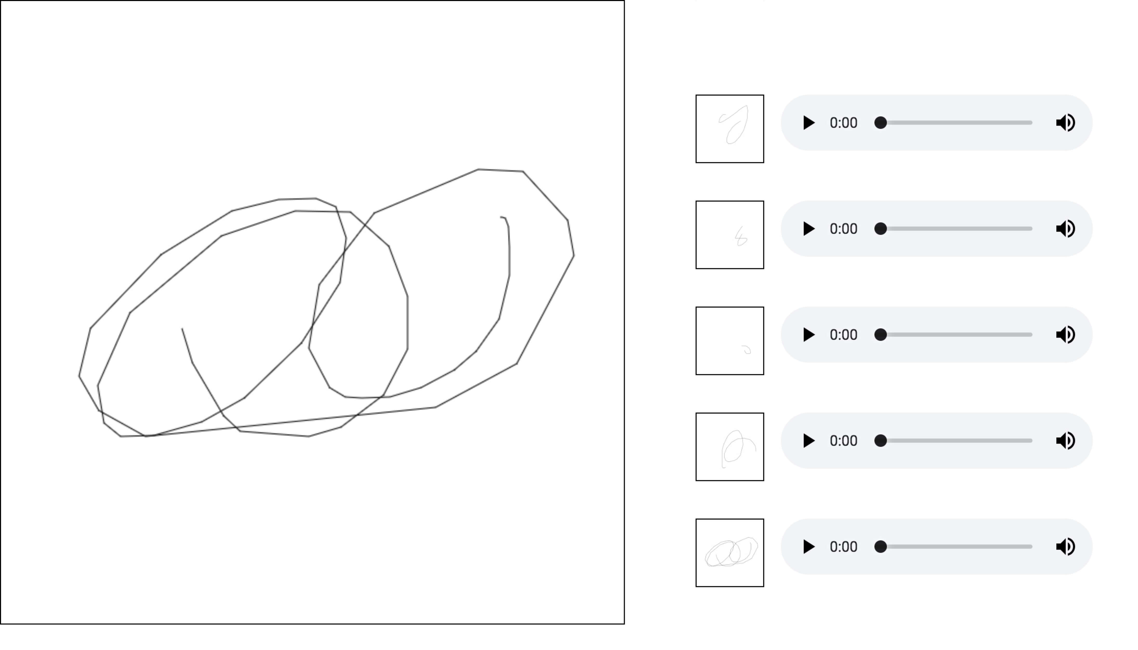
It’s quite difficult to make something messy sounding with this tool as the tempo of each person and instrument always fits into a defined space, this is in contrast to this chrome experiment that functions as a similar repetitive instrument capturing more nuance from human input.
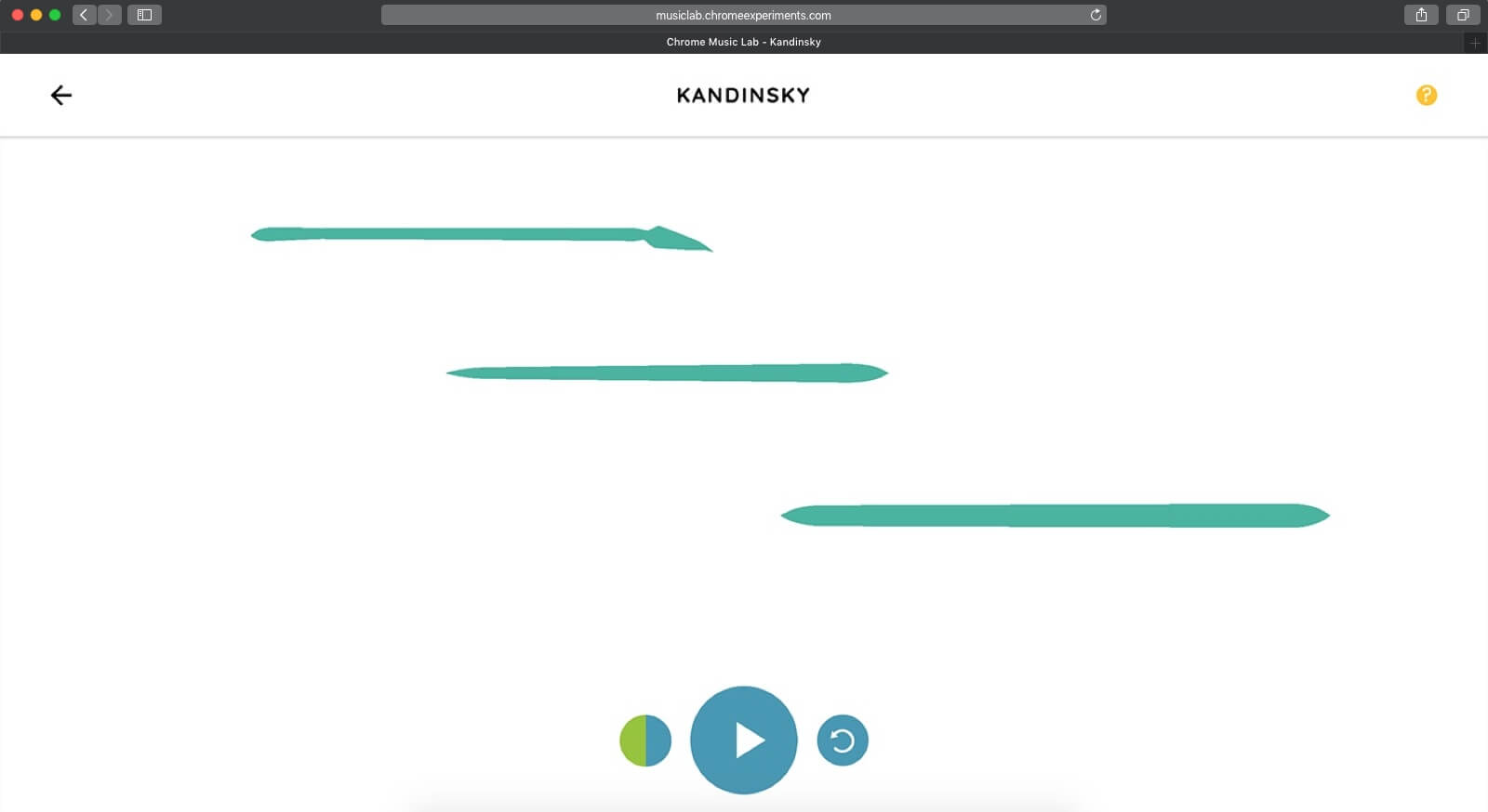
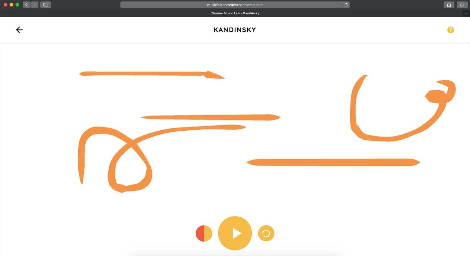
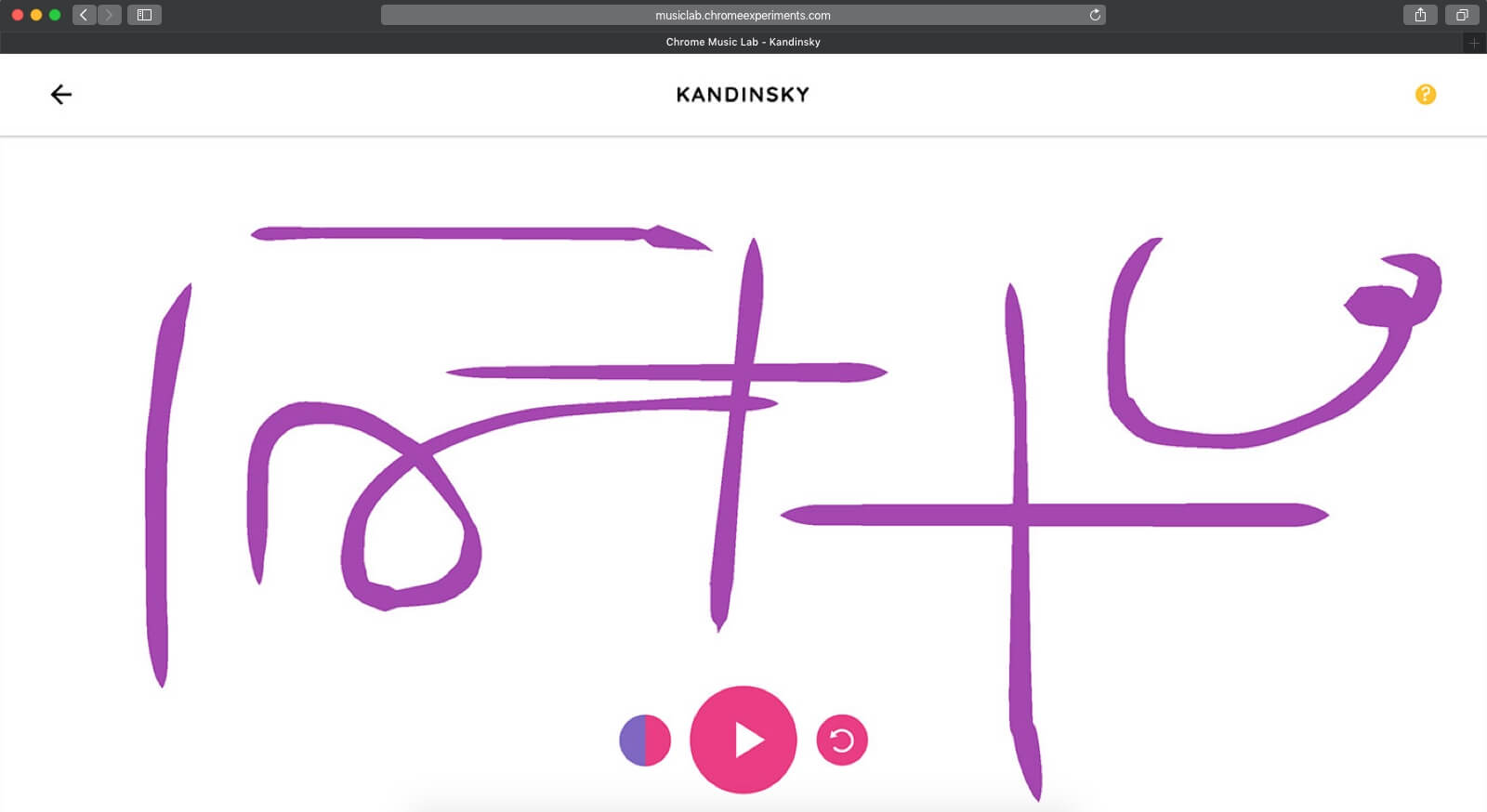
This instrument uses colour as a tone control, allowing the user to choose between three options, however, does not allow mixing them together in the same piece. It treats the Y axis as pitch and X as time but has a delay between the end (right) and start of repetition (left). Results in something semi-playful.
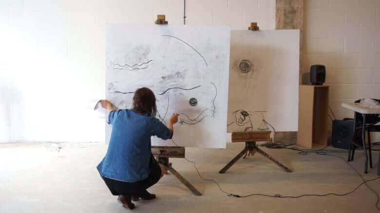
Computational artist Anna Ridler created an untitled drawing sound piece in which she did much the same as the previous chrome experiment project but with greater fidelity using a real canvas. However, this was more a representation of the technology’s behaviour rather than as a tool, for creation. Plus, through the biases the built into it—by instructing it to layer the historical sound—it becomes chaotic at times
Pudding.cool already has vast sums of contextualised and visualised data, that I thought I could convert to sound or introduce an audio element. I found this article that maps established and up-and-coming celebrities on a scrolling narrated webpage. Each avatar is highlighted at a fixed scroll point and a chart of their fame gathered from Wikipedia page views is mapped to the yellow and orange chart.
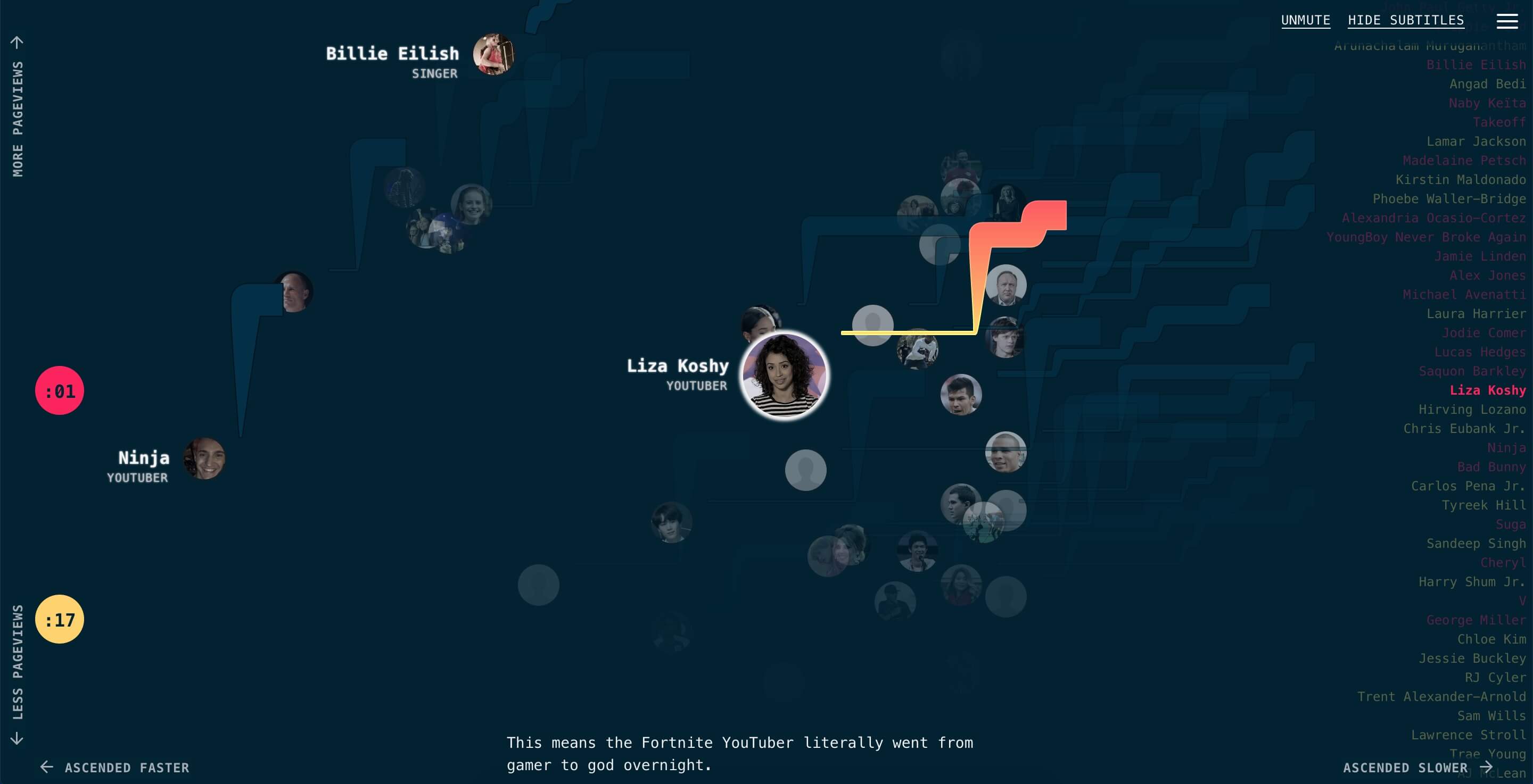
One concept would be to play tone for 100,000 of views in month for celebrity, interactive by choosing celebrity, different tone for comparing celebrities.
Building on from the 1000 years of climate change, one of my initial ideas was to take another data set with a temporal element and represent it through sound preserving the temporal factor. This could be homelessness compared to empty homes comparison. The numbers rose gradually and fluctuated depending on the area and I feel wouldn’t come across well over sound.
One final brainstorming concept is to devise an audible system to translate braille.
⠁ ⠃ ⠉ ⠙ ⠑ ⠋
Braille is a textual translation of language with an obvious visual factor that I could exploit to create a sound system to complement the dot system.
Artists cave
This is another sound app that takes advantage of the temporal aspect of the source data. Solarbeat by Luke Twyman plays a sound each time a planet performs a full orbit and includes some user controls for the sound effects and visuals to emphasis the sounds. Thus the planetary movement is directly translated to sound and can be read in only sound. I wanted to go ahead with the concept of completely translating data from one communication medium to another in the form of sound.
After discovering this project I went Tone.js as the tool to create and manipulate the sound for my project.
Concept
My initial plan was to create a drawing tool that translated as many of the nuances in the fidelity of a person creating a drawing. So I got the basic structure down with an interface that could record the sound with the final image form. The canvas was divided into columns with the notes C–G across and pitch mapped the same way with rows. As such we then had a grid to map movement to sound. The recorded sound would thus represent the movement of the visual drawing, creating a translation.
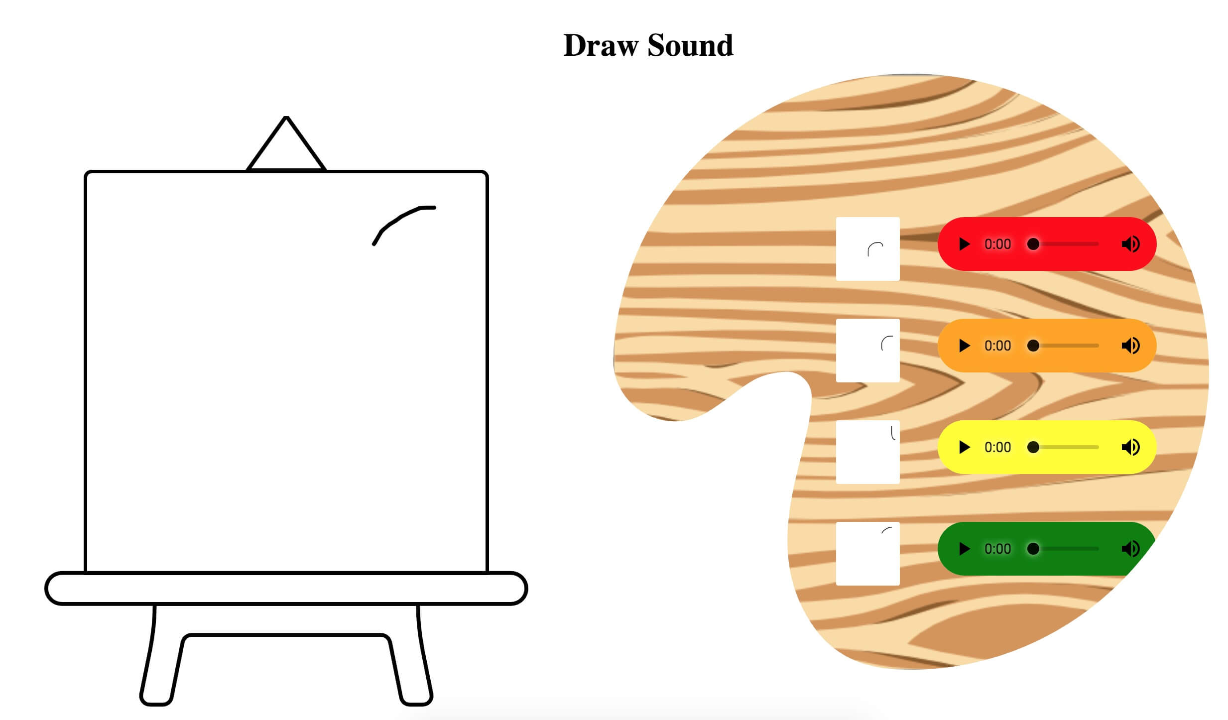
I wanted to create some visual metaphors to help contextualised the interface and make it read naturally. So as an artist would, I gave the canvas an artboard that would also support the drawing instruments/controls beneath. As the audio products would ideally reverse translate back to the drawing, these could then become the paints on the artists’ palette. Ended up looking ridiculous and impractical.
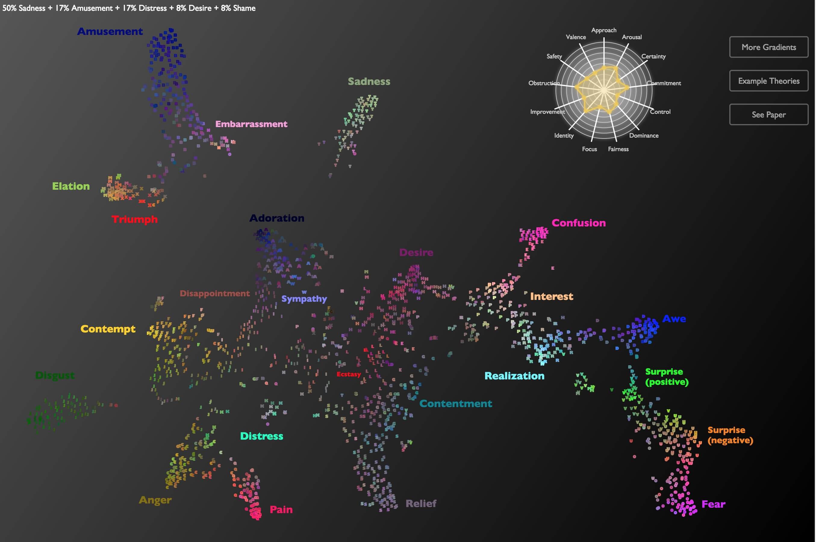
Alan Cowen has a number of interactive audible visualisations depicting human emotion. The one pictures above maps human recordings of emotions, each quantified into a proportion of 13 basic emotions, although more are identified in the accompanying research paper. All of these visualisations map quantified audible emotions to a coordinate system in space, colour and alpha/numeric system. This therefore makes defined options about the visual translation of human feeling to colour, and the proximity between them. By mimicking some of these properties in my project, I hope I can accurately align the same connection between the individuals’ perception of their own emotions and the perception of the visualisation.
Synesthesia.com makes an attempt to invoke chromostesia for those without the condition with this project. It acts like a meditation app would, with instructions and musical stimulus. For me this didn’t work to well however, artist Timothy Layden was able to paint his response, one of which is below.
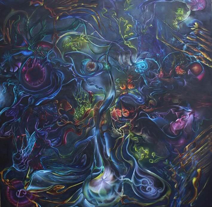
These depict his personal response to the stimulus, which will vary for each individual with chromesthesia. This gives me some freedom to reflect my own response in the drawing tool, however, it would be better to find some common ground (at least among those who don’t have the condition) to help the project convey to a broader audience.
This is another attempt to convey chromoestesia by Kaitlyn Hova. The visualization is comprised of blurs of strong coloured light each assigned to notes. Reddit user Beeapps described chromoestesia like the brightness of lights in the vision of someone without the condition. If the volume remains constant our eyes don’t need to adapt, but of the light goes form dark to bright, or volume from quiet to loud very fast, their vision is obscured like our eyes would need to adapt.
This example is very different form the last and had the potential to to create a more interactive and realistic representation, however, I feel the number of variables to manipulate is too few, just being blurs of light to notes.
One direction I had thought to go was to have the user create an image and then post evaluate it to product an artefact according to some rules, thus it would follow a similar direction to Timothy Layden art. However, I wanted the user to perceive more of a connection between the input and the translated output. This would be done by giving transparency during the usage of the tool through audible feedback.
Brush fidelity
Building on the previous metaphors of what an artist could have in their studio or at their disposal, I gave each new drawing a frame for then to hang on the wall.
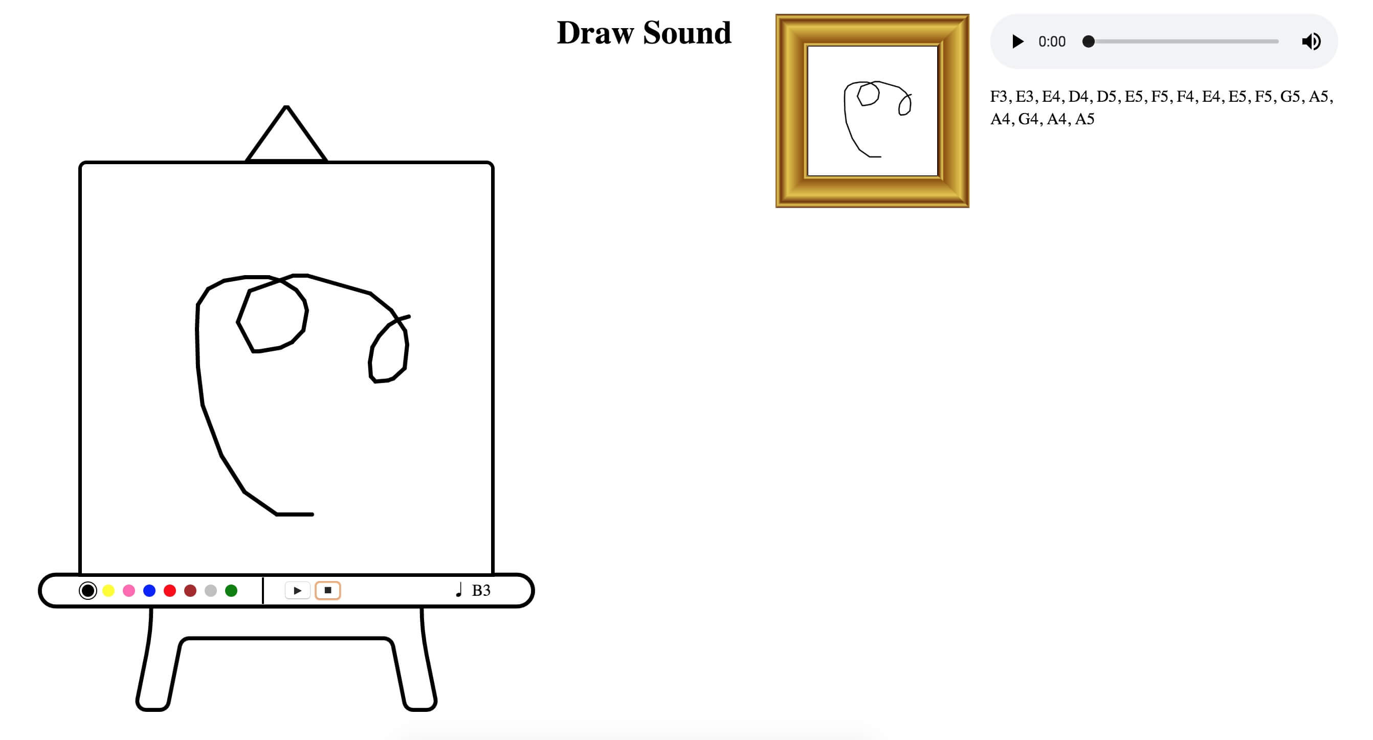
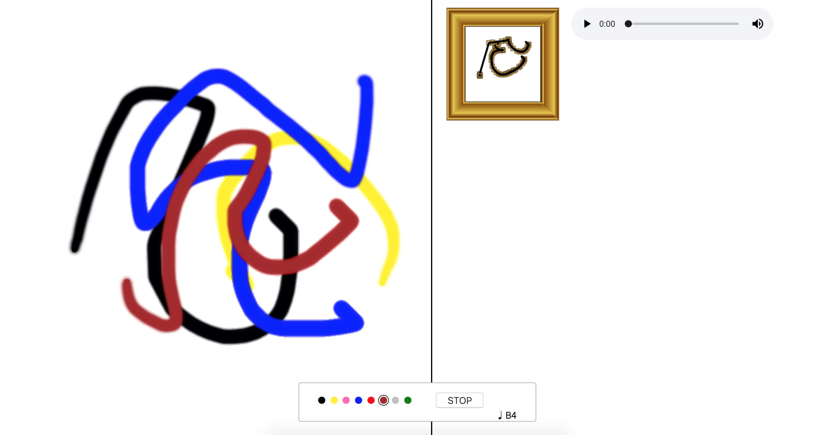
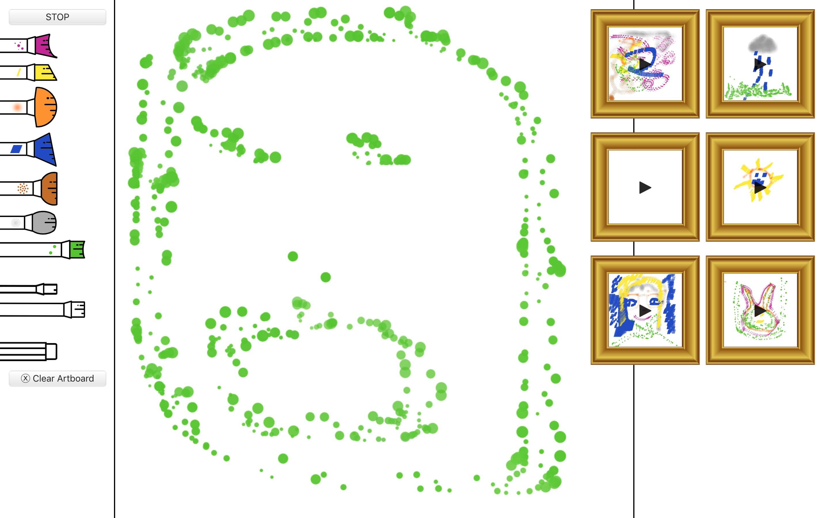
I added a start/stop button to the artboard tools to change the drawing interaction. Before I had it set as a single line drawing where the user would begin a drawing when the user pressed down and finished and saved the new image and recording when the user released. This was not a realistic representation of how someone would create an image. This method with the user triggering the start and stop captures, through silence, the pauses and more variables on the person creating an image.
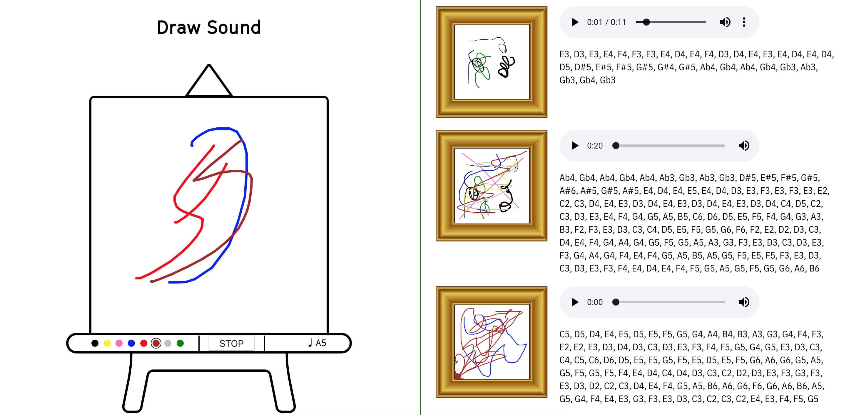
One of the main pieces of data not visible in the final saved drawing was the list of played notes with their associated synths. Each colour has been associated with a different synth. For the time being I added this list to the output and hopefully i would find a use for it or another way to convey it.
One possible interaction I was not currently capturing was the ability for someone to paint white multiple brushes. I have tried to simulate how this would work, but I was unable to get this to work on an iPad where I can have up to 10 touch inputs.
Initial feedback I got was to take the user further away from the data and make the interaction start visual rather than technical (with the note indicator in the lower right for instance), and then translate it to sound. This abstracts the user away from the translated portion and only witnesses the raw input and final output. Also for it to be more playful, I had tried this with multiple inputs and this could be done with alternative input patterns, such as a reflection pane down the middle. However, I wanted to keep this close to the painting metaphor, so I went back to focusing on the number of captured variables.
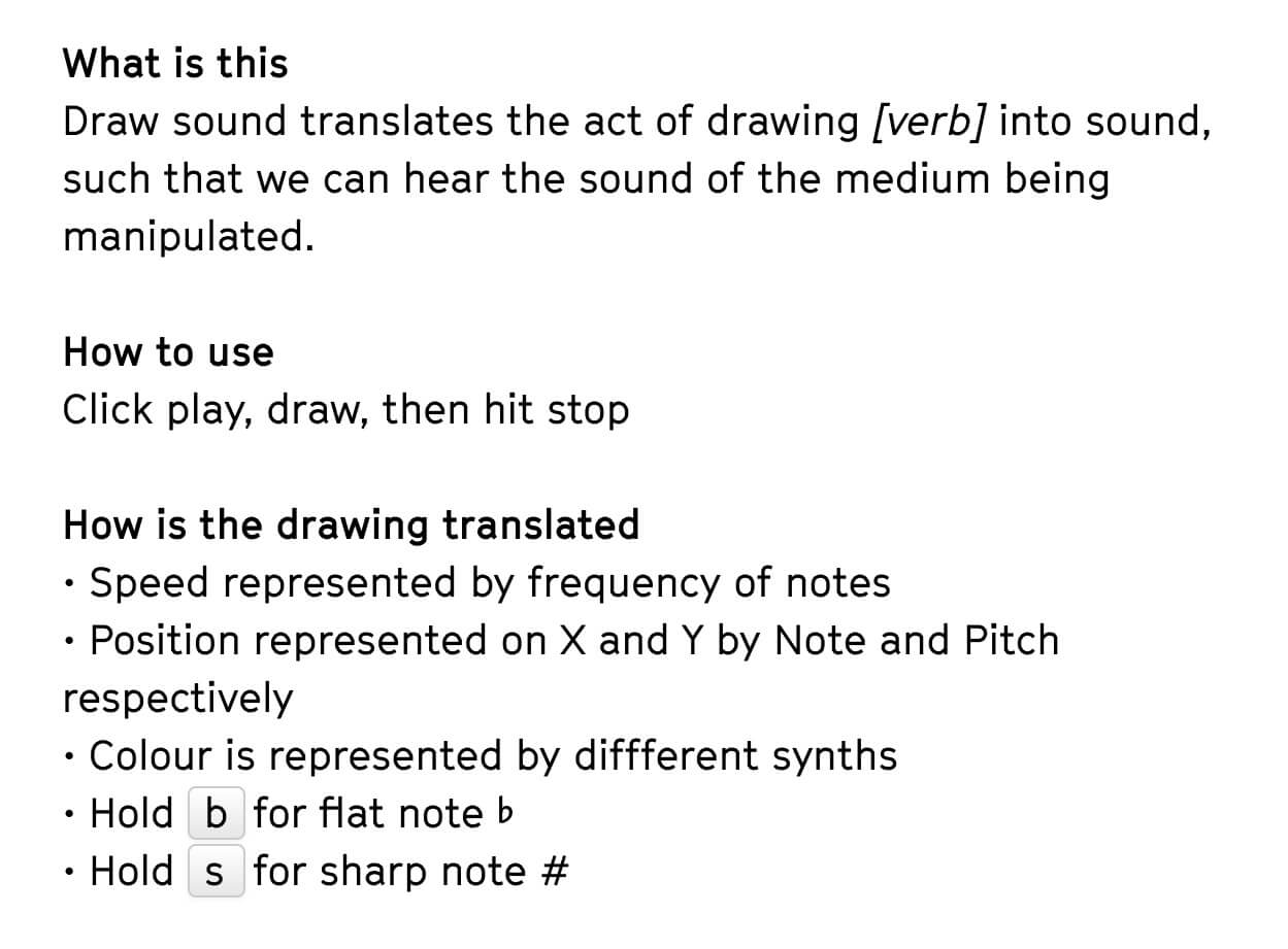
I had added this info screen beneath the main interface, however now I was removing technical aspects from the user this had to go. I had a feature to hold the b or s key to make the line thicker or thinner respectively that would be represented with the note becoming sharp or flat. This was a very techie interaction and would have to come back in a more visual manner. As for the other captured variables, the user hears these pretty clearly anyway.
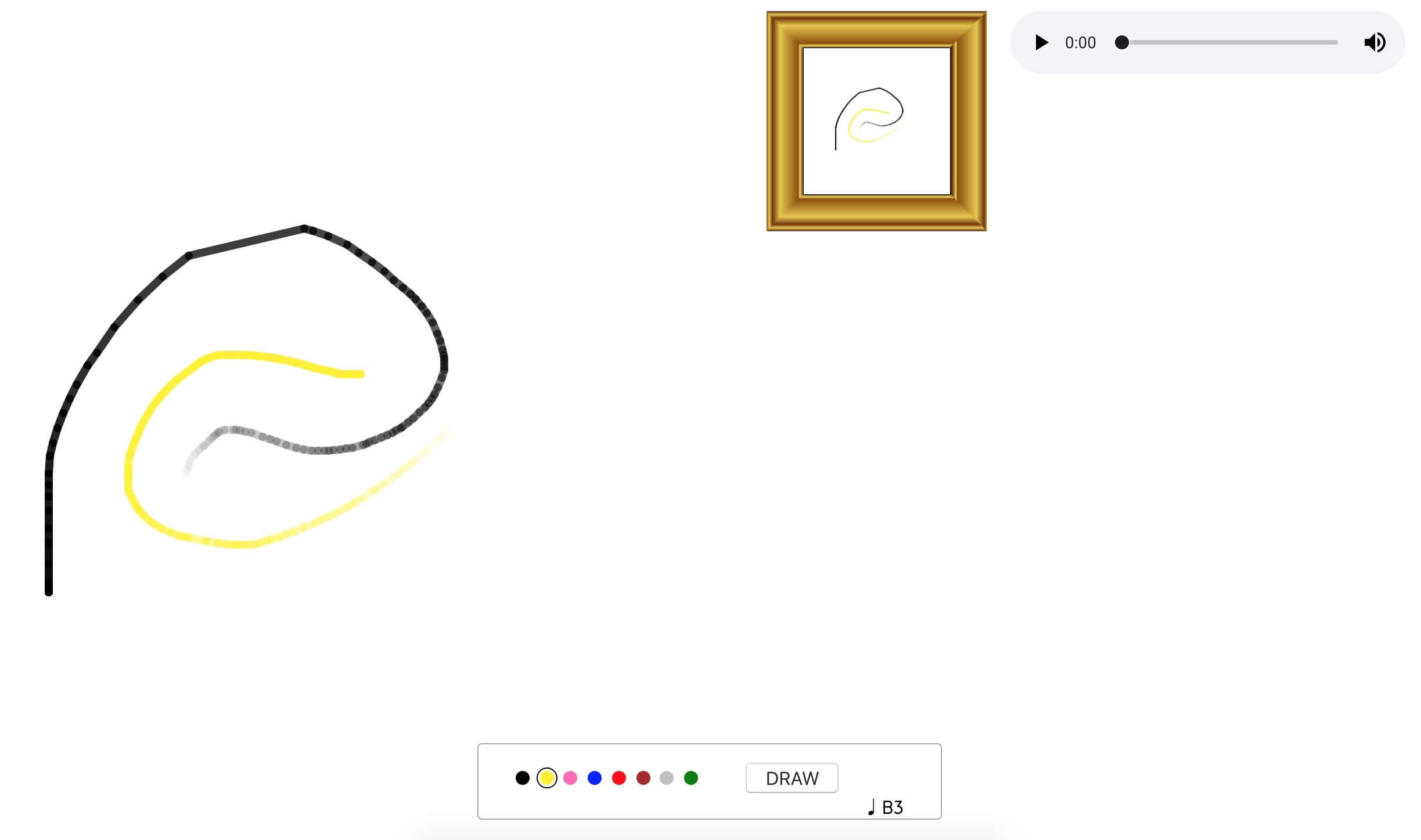
I added the brush paint fading as the brush would run out of paint, captured by reduced volume over time.
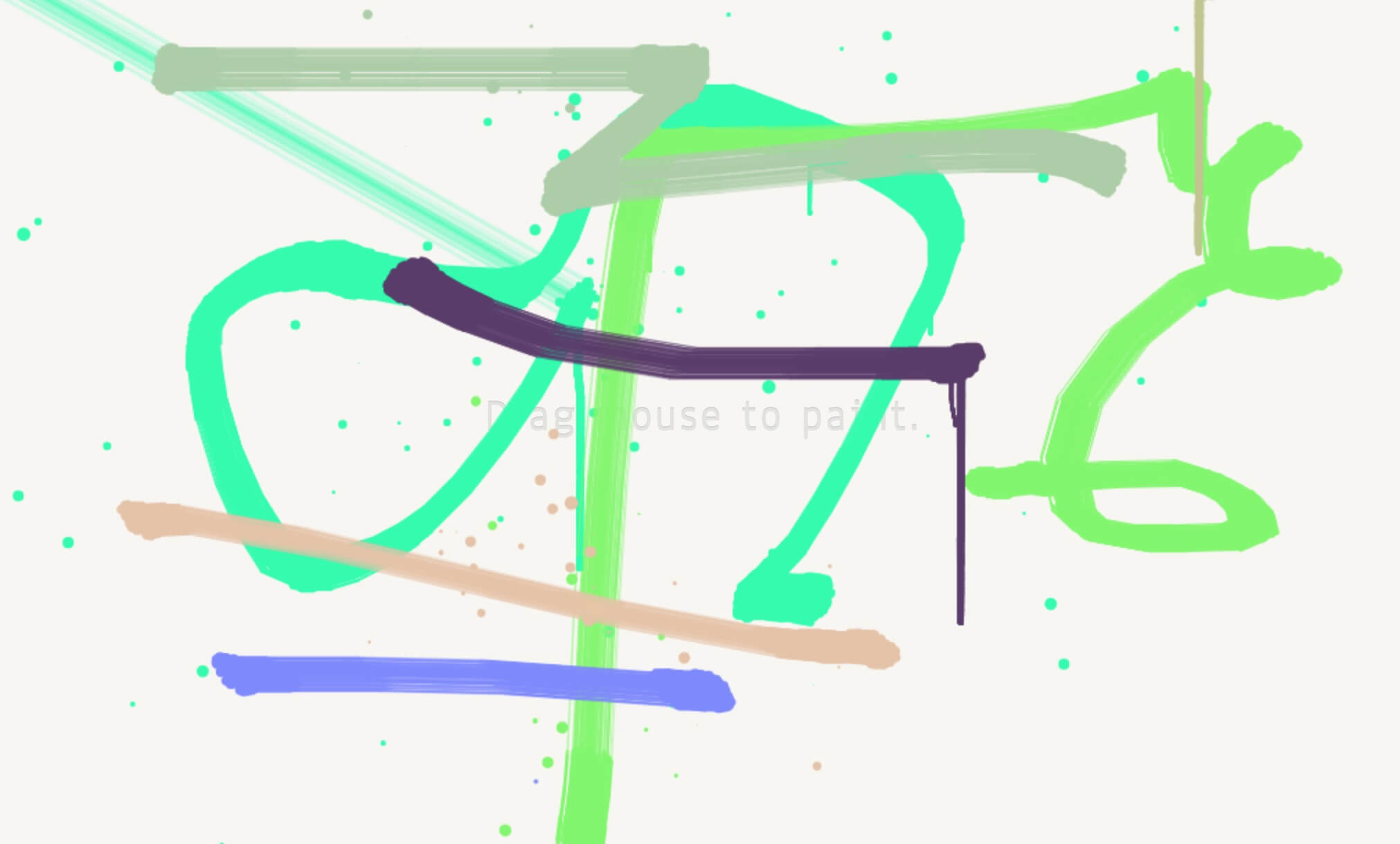
I found this example with really realistic brush strokes with dripping paint and fading colour with stroke speed, but it keeps the brush strokes the same for each colour, and I wanted to capture more of the emotional ties to each colour in shape on the canvas.
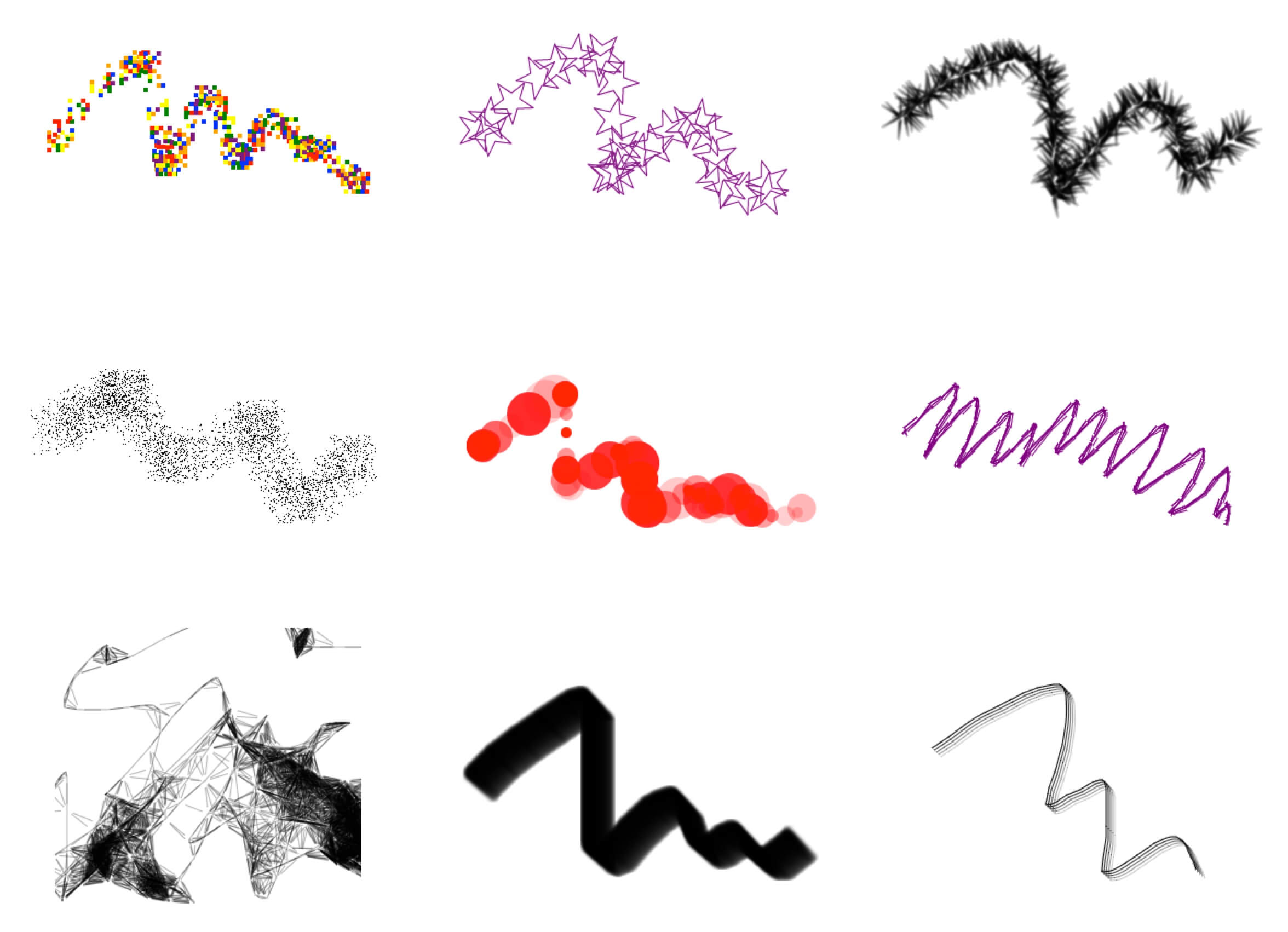
This next example I found gave me more of what I was looking for, but was also a pain to implement. Neither of these, the way they were implemented, like to have the brushes swapped on the same canvas.
These new brushes did give it more realistic feel and less drawing lines on a computer.
This project along with the one involving Alan Cowen both quantify visually using letters and or numbers. I found this to be a very unnatural way of conveying this information. As such I decided to remove the notes indicator from the lower right of the artboard.
Colour ≈ Shape ≈ Sound
Both of the below give simplified versions of research into synaesthesia. To get a more accurate translation between colours and sound, I found both of these charts.
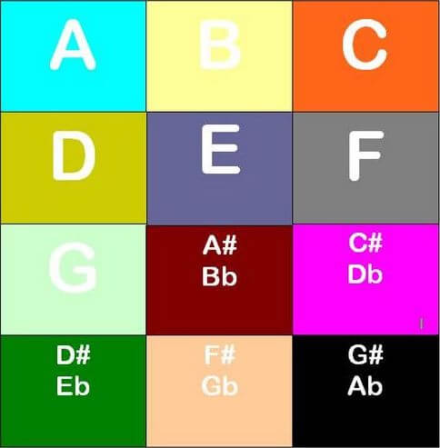
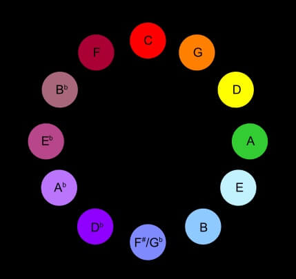
Both of these translate notes rather than synths, which would result in a more robotic output, but I could use these to approximate the synths to notes. The other obvious issue is both give contradicting colour to note indexes. The grid image above associates the colours to individual personal experiences, as someone associates the sound of a car or person to a note and therefore the colour of the car to the note. This introduces an interesting predicament, do we stereotype and associate inaccurately for a broad audience, or take the Clavier à lumières wheel example above and base it on an orderly mapping of the colour spectrum to notes.
The Clavier à lumières I felt was to mathematical, however, in this example by Charlie Jarboe, as I skip through the video I can get a sense that the sound and colours I’m witnessing do correlate most of the time. But these were all illuminated rectangles, and I wanted to record more contrast between the colours.
In the context of film this colour wheel is used to align genre with audience mood, this I feel could be translated into this project. It will need some interpreting and editing as some of these colours are a bit ambiguous. Such as opposing red and green with similar emotions, and pink which in as interactive simplified visual environment will not likely product the same emotive reactions as in film with a provided story.
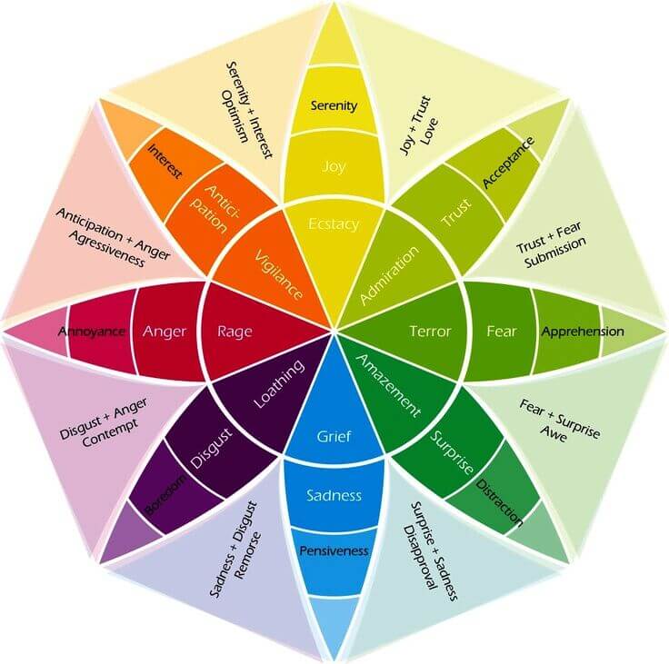
So with all that said, I began assigning shapes to each colour brush. These would either align with a visual representation of how the sound is created and travels or an arbitrary shape to try to match to the sound.
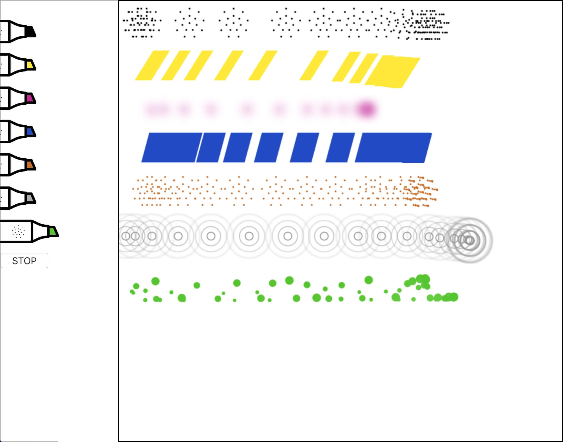
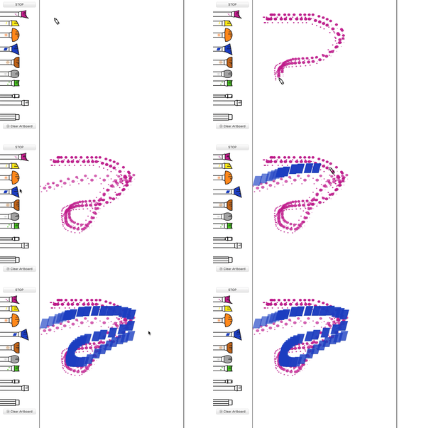
I added a still of the brush shape to each coloured pen to help communicate the sounds of they did not resonate with the specific user. This was a painting app after all so I also needed to swap the pens to brushes. I matched fairly closely with the shape of the brush mark on the canvas the shape of the brush tool selection.
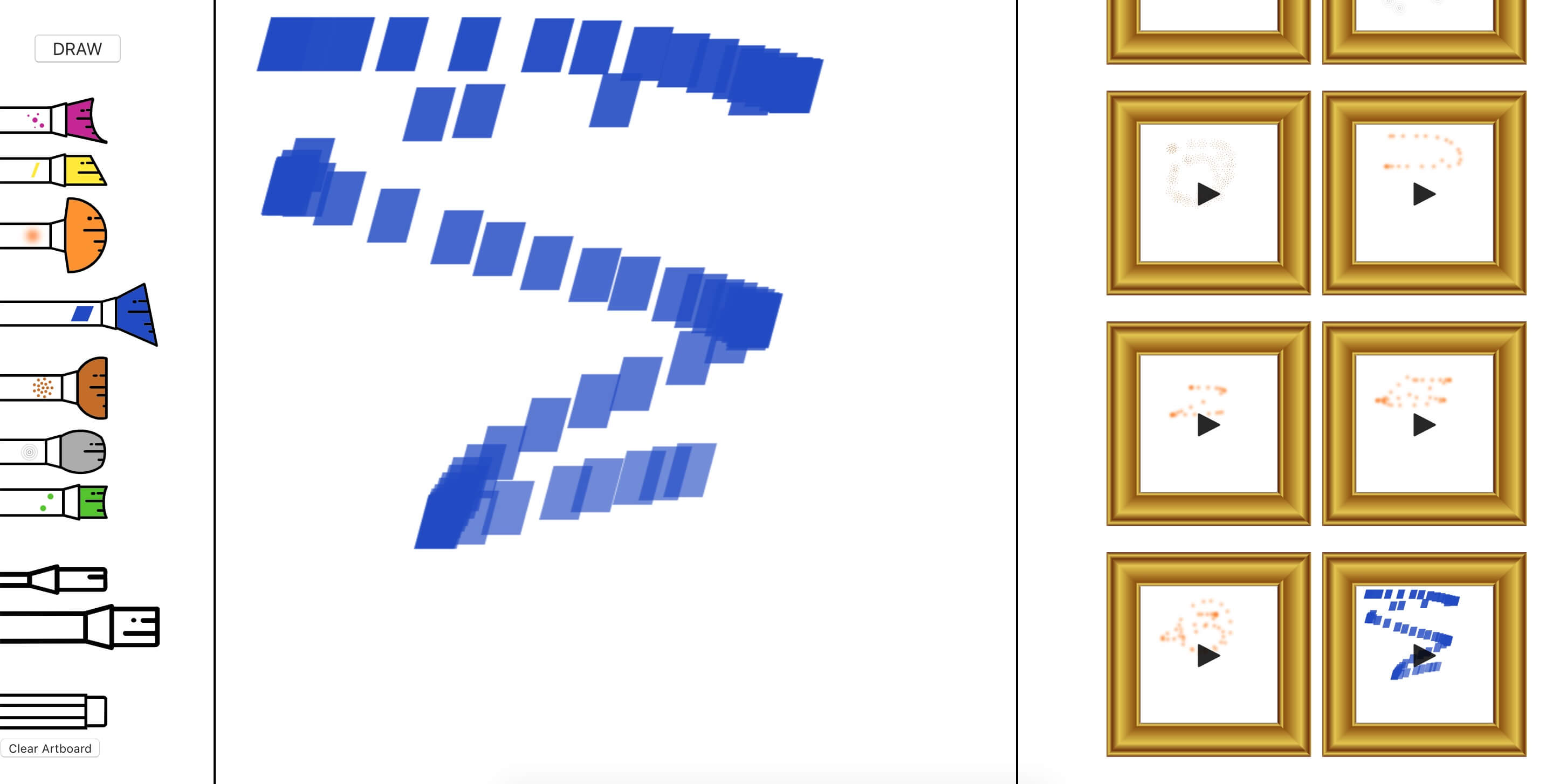
I brought back the sharp and flat keyboard shortcuts in the form of two brush sizes, which doubles the number of brushes and thus variables to capture.
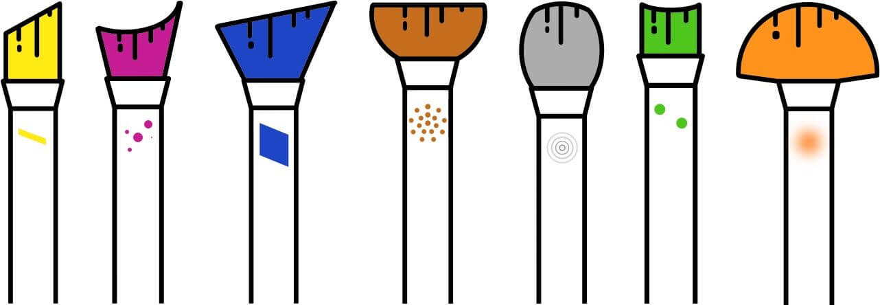
When it came to matching synths from Tone.js to colours, there was a clear disparity between the brush and the colour. So I associated each colour to a tone, based on the feeling that each evoked. Such as one would colour grade a film to evoke certain emotions. For instance, blue strung out slow synths for horror films and orange faster beat tracks for comedy’s.
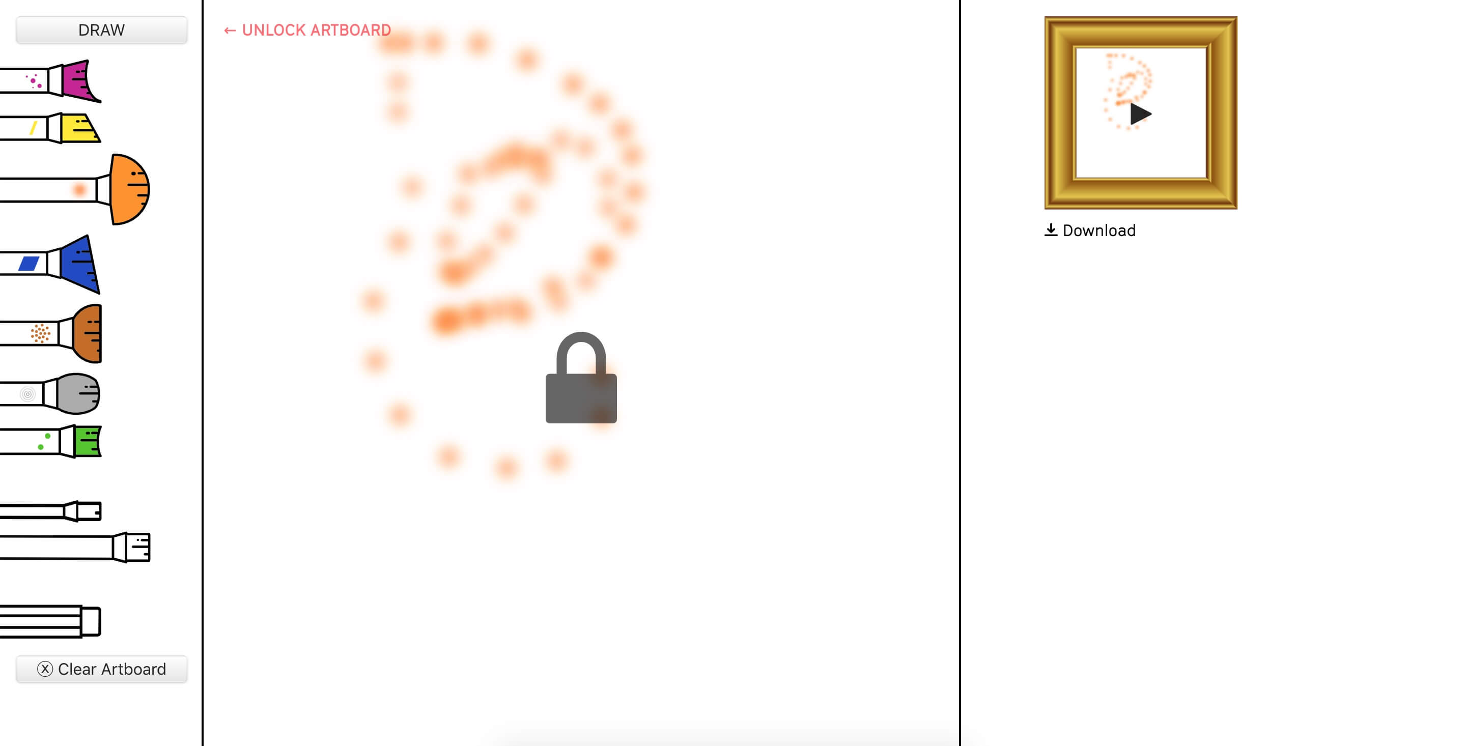
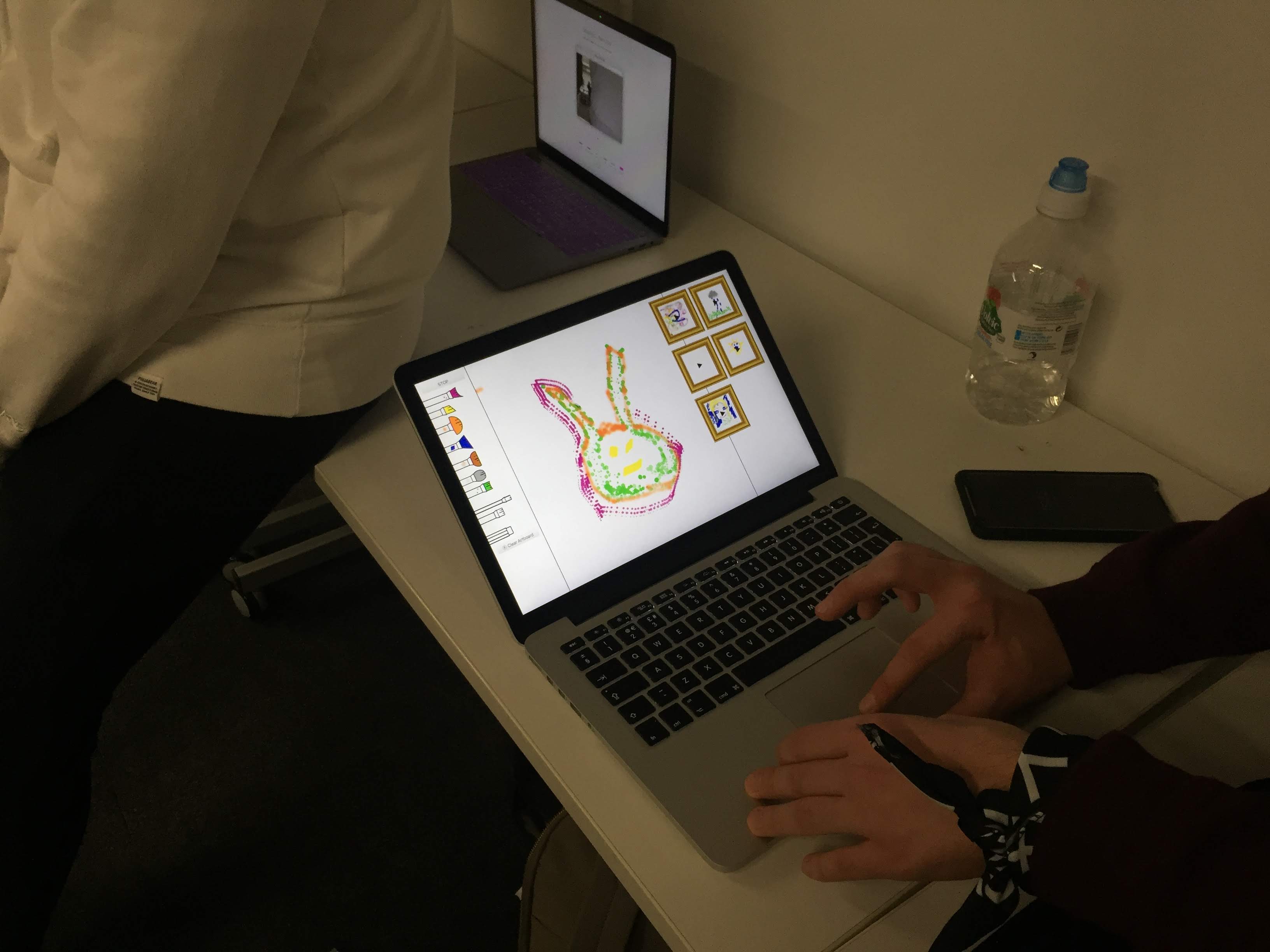
I made some final alterations to make it a bit more obvious that the user needs to dictate when they have started and finished their drawing. In the final crit it was mentioned that maybe it would be better if the grid was changes to only reflect notes or pitch on the Y axis. This would work in the same was as the Kandinsky project.
Data for Change
Smoke visual metaphors

Initial concepts from the studio workshop included filling a dance floor sized area with dry ice smoke to illustrate the pollution levels. This would correlate to the number of people in the space and how much they move, to visualise cars moving around a confined space such as a city.
In addition to a face mask people could wear that, similar to a cigarette filter, would discolour over time as exposed to air pollution.
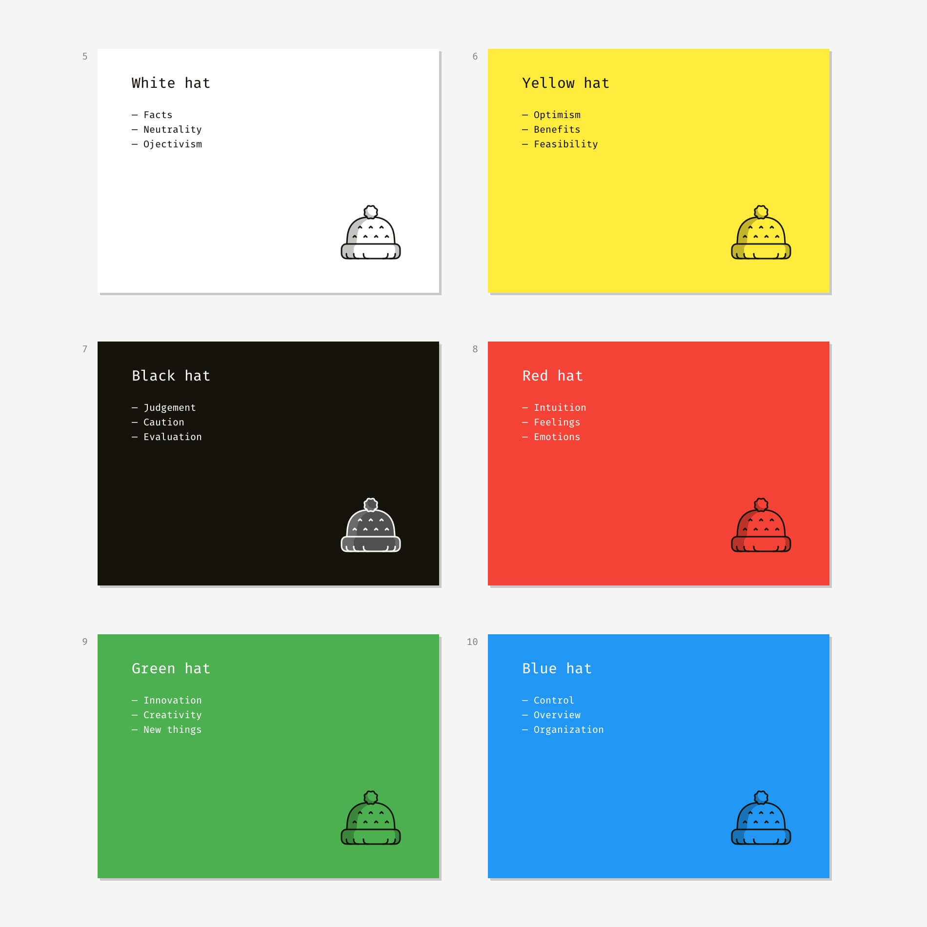
Six hats is a group ideation method developed by physician Edward de Bono, to provide a balanced group of perspectives to a room. Each hat is metaphorically worn by each person who must play the role to facilitate the ideation. As they are so clearly divided I thought I could wear all of them sequentially and see how it went. It resulted in the following.
Could try building on the famous Trainspotting choose life speech. Though in the context of air pollution it has different connotation to the original, both have a free spirited pro-life feel.
Encouraging the government through intervention to intact legislative change to force people with greater repercussions to act better.
Rooftop gardens as a source for community engagement.
Embedding the idea in cultural media as Doctor Who has done in the past.
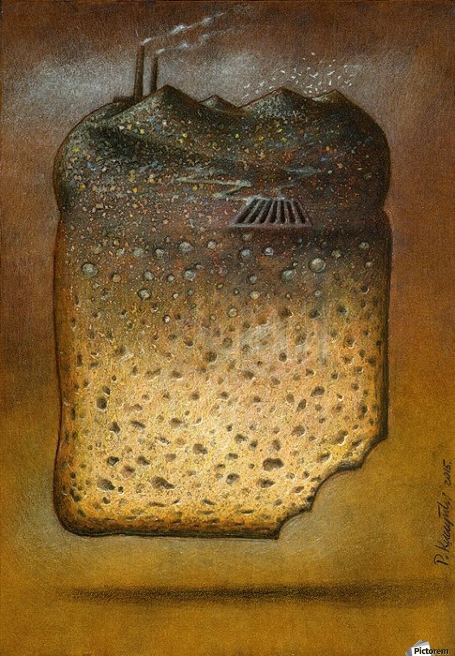
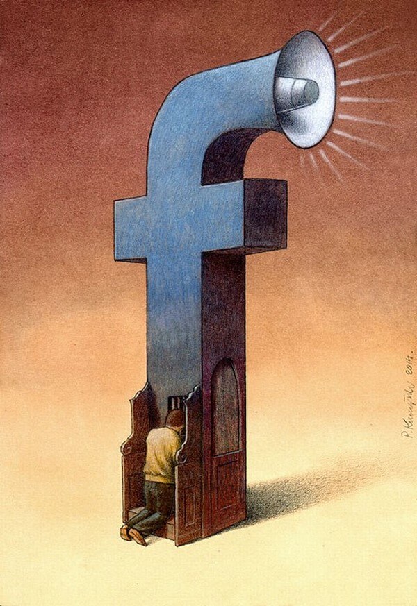
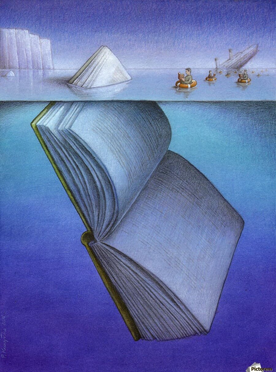
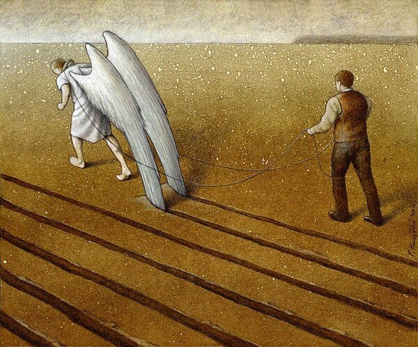
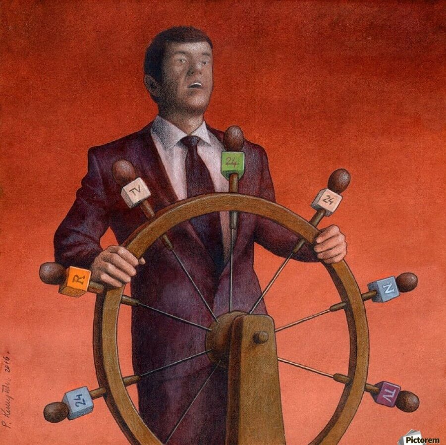

Political satirist Pawel Kuczynski has made a name for himself with images including those above. These images leave room for extension for interactive data visualisation. They all have provocative physical objects that can be anchors for interaction and many include elements that can incorporate data dynamically.
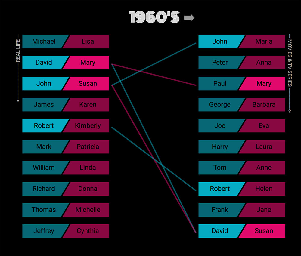
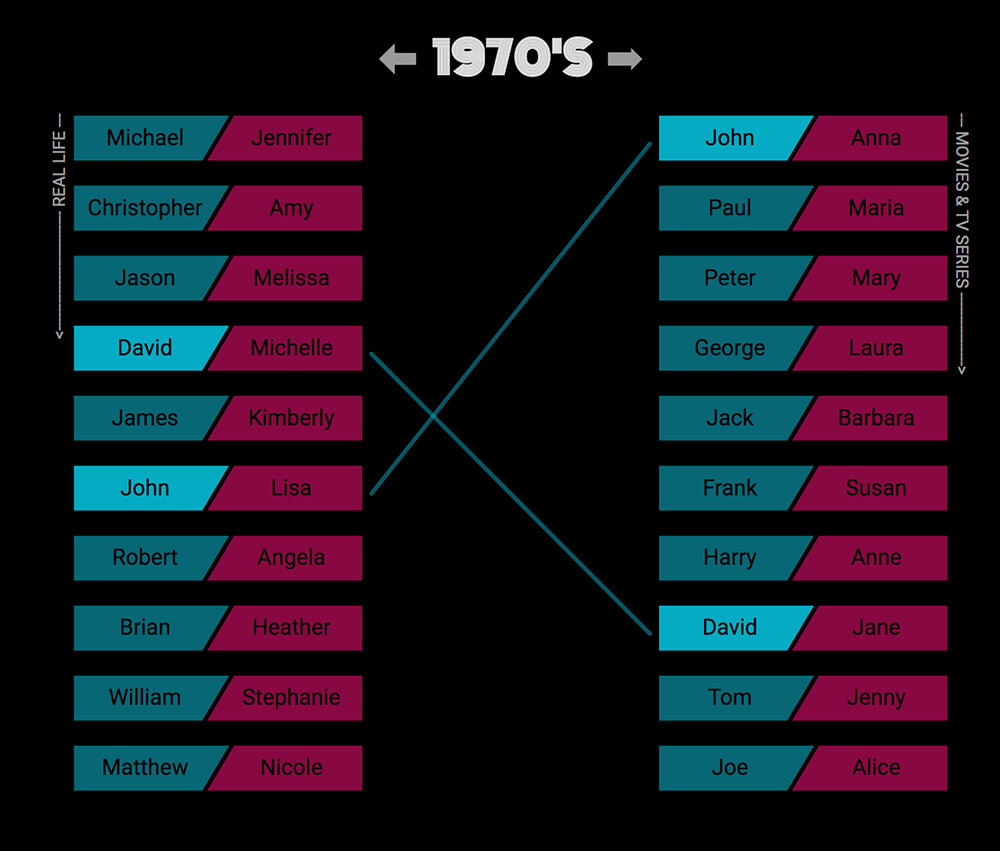
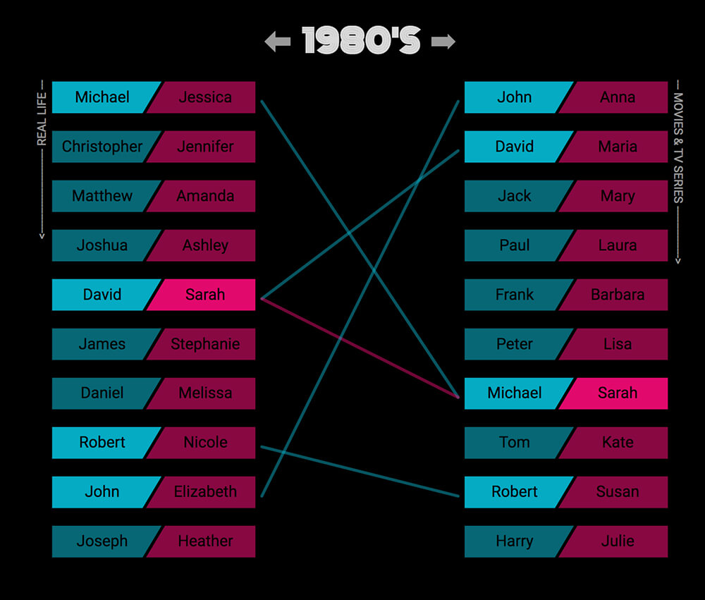
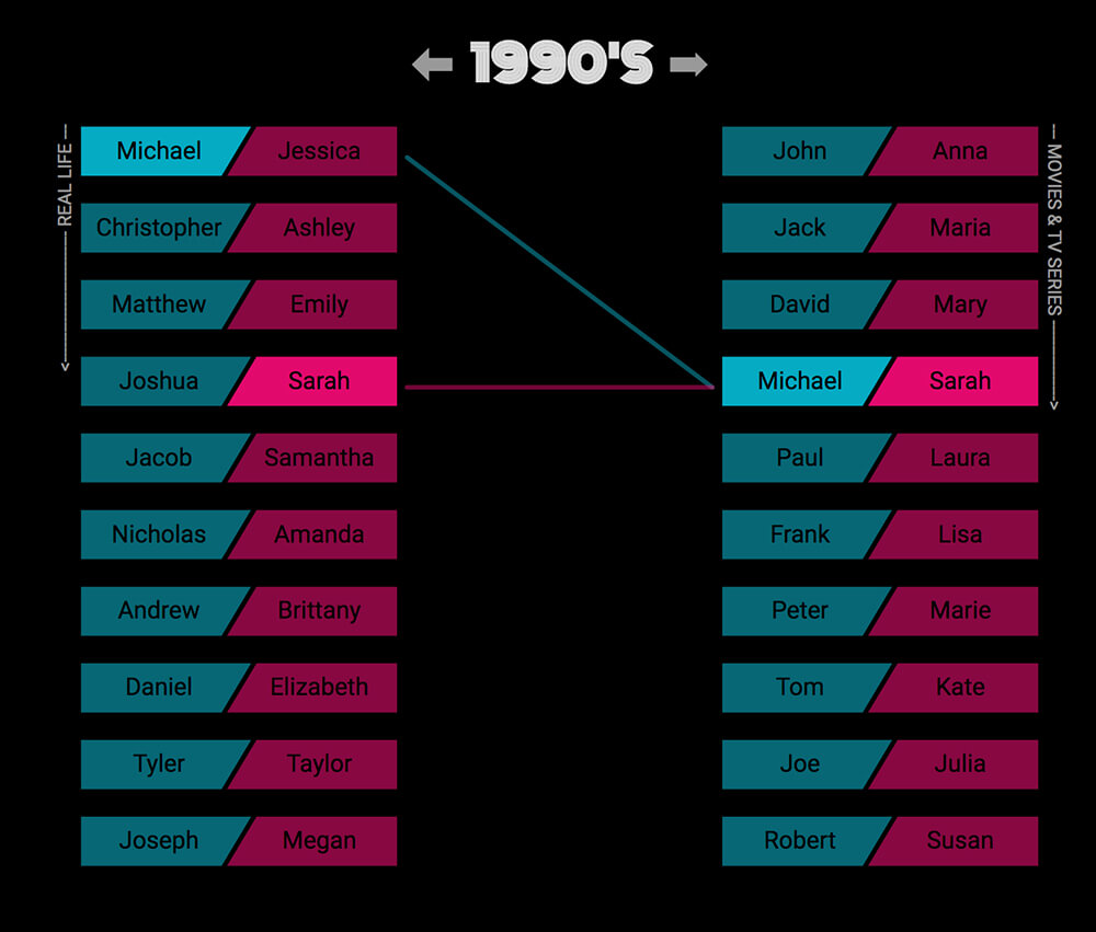
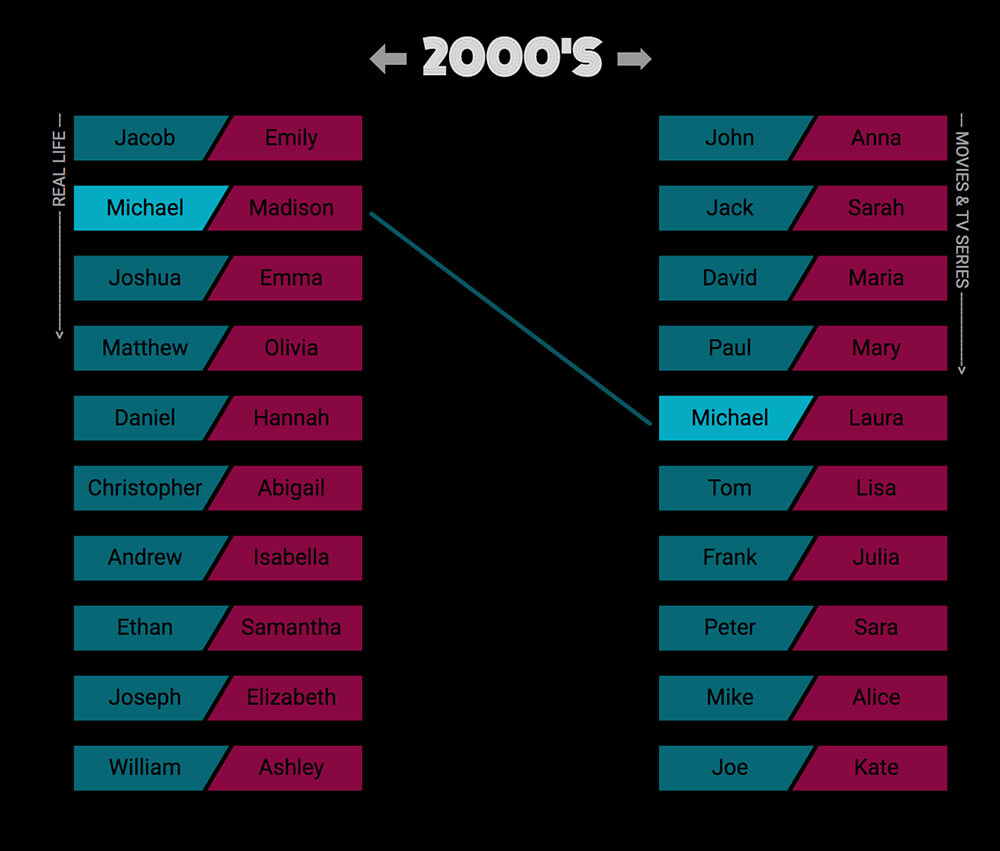
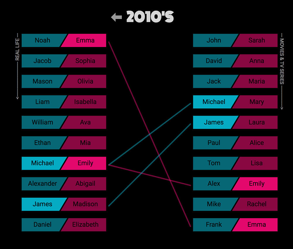
Mary Zam made a number of visualisations for Cinematic Names, one pictured above. They all show a contrast between at least 2 comparable datasets. The one above matches the most popular male and female names in cinema per decade. This visualisation could be translated to pollution data across time and location in a more interactive way.
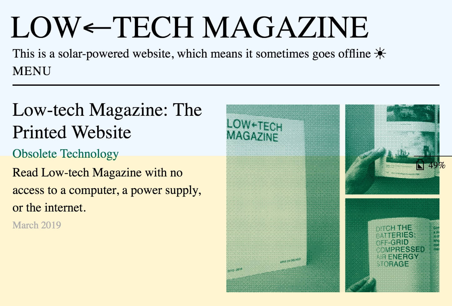
Low Tech Magazine make the invisible energy use of a server blatantly visible through its implementation. Not only does it keep a constant battery meter spanning the entire viewport, it keeps server, and weather stats at the bottom. Weather, as the server is solar powered. Building on this, I can change the data to local air pollution data and the environment to interfaces we engage with anyway that already have air quality data, weather apps.
One way to make this data more interactive is through an interactive smoke visual, building on from the initial smoky floor concept.
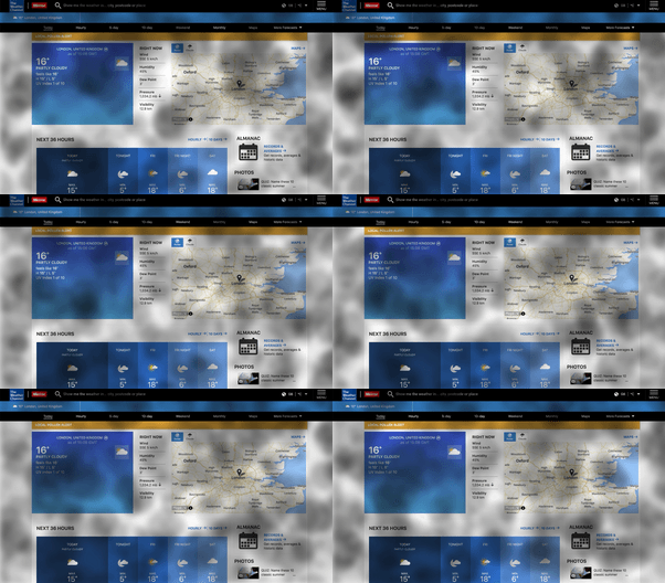
Click to simulate more pollution. The density, size, colour, speed can all vary to represent different data points from AQICN for cities all around the world. The advantage of this system is it puts the information directly infront of the user. Similar to how some weather apps change the interface to match the current conditions. This could also be used on interactive billboards and displays in public spaces atop the existing interface. This is similar to this projects that intervened in public advertising boards to spread ulterior messages.
From the interim feedback I was guided to focus more locally rather than designing a system for change. Plus take a single dimensional gamification approach to the interaction. This app aims to gamify air pollution with levels that either hinder the players mobility or manually clean up the planet to highlight issues around air pollution. All of which however, is only a game and only raised awareness rather than forcing change.
The Democratic Ledger
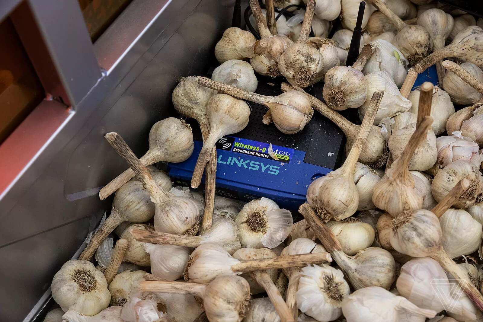
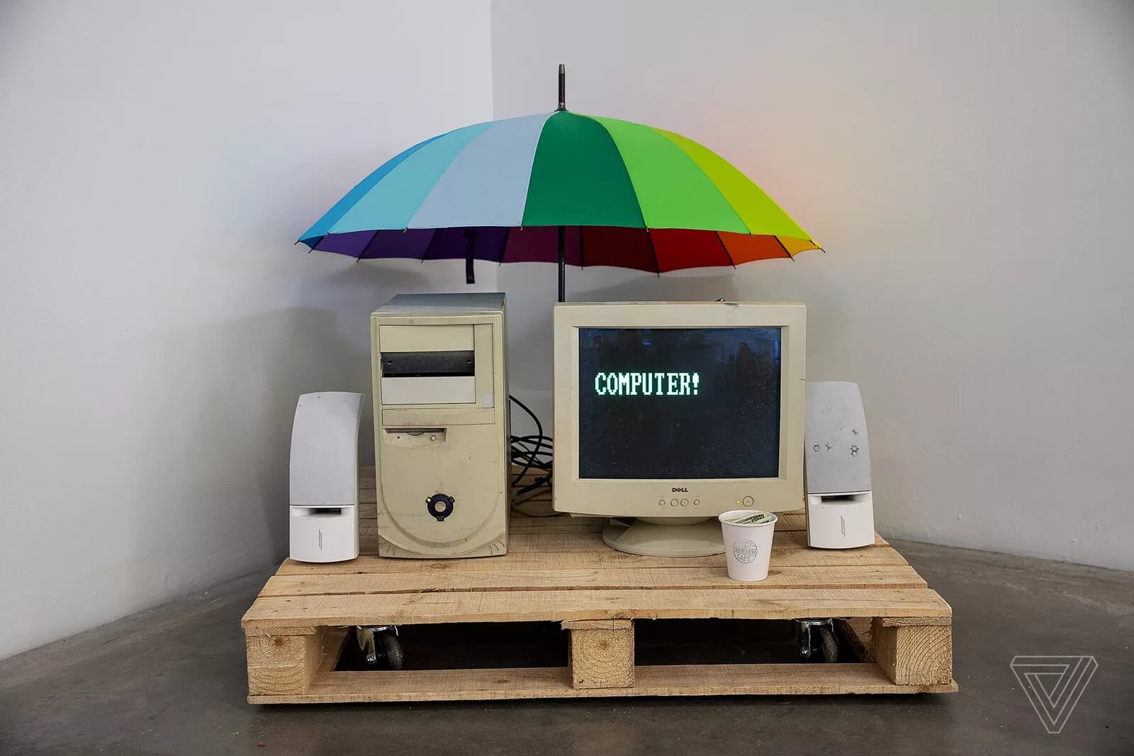

The Art Happens Here is an exhibition that suggests that the forgotten parts of the past can be presented as art, inspired by Chinese censorship. This concept could be extended to manifest artefacts from today, to be presented as the past, to highlight how air pollution could impact these elements of society, and speculate how they will mutate in the future under the worse conditions.

Tadashi Kawamata created a huge exhibit to highlight pollution in the sea at the Maat in Lisbon to question ecology and tourism. Video of its creation. It may be more inpirtant for this project to highlight pollution in all it facets rather than just air pollution to help convey the severity.
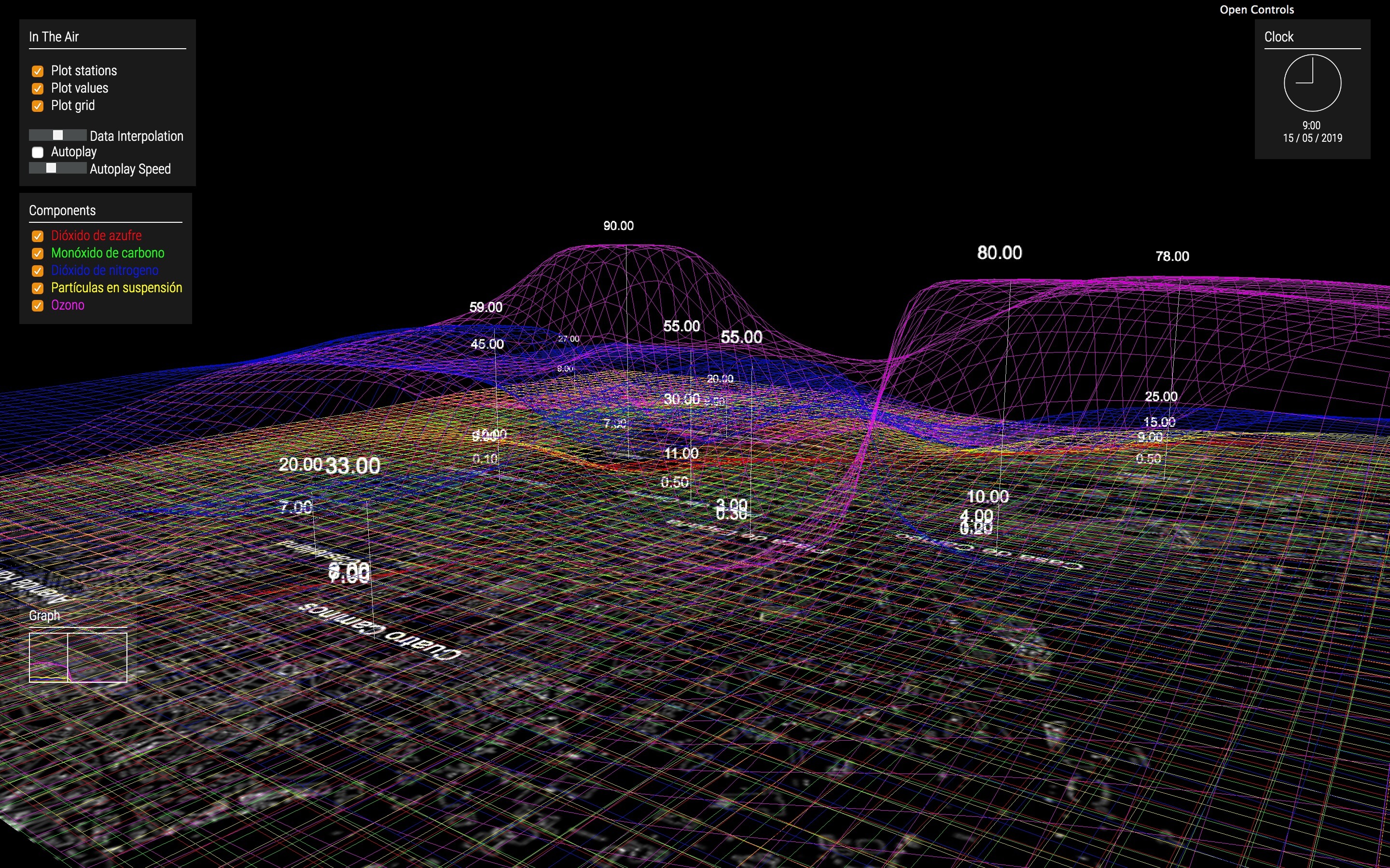
Finally, In the Air plots air pollution over time in 3D space. It creates an incredibly cool effect as the visualisation auto plays, however without the comprehension of the significance of each colour in the graph, its meaning can be lost.
A few years ago a video titled The Selfish Ledger made by a small group of Googlers as a speculative design project was leaked. It presented a smart AI assistant that would make trailered suggestions for individuals to become better people in accordance to a positive to arbitrary criteria.
I feel this is a really good way encourage someone to move default state of doing nothing to something, rather than the black and white approach we too often see in activism and legislative change. I want to extend on this concept in a more democratic way, where it uses the user to help the user but is transparent about it.
Concept
Similar to how Google Chrome is wildly complex under the hood and overly simplistic to the user, I want to leverage machine intelligence to dynamically suggest personalised recommendations to individuals to counter air pollution through creating small meaningful habits. The app will gamify this experience by using a level system that can be compared to others. This concept is not however limited to air pollution.
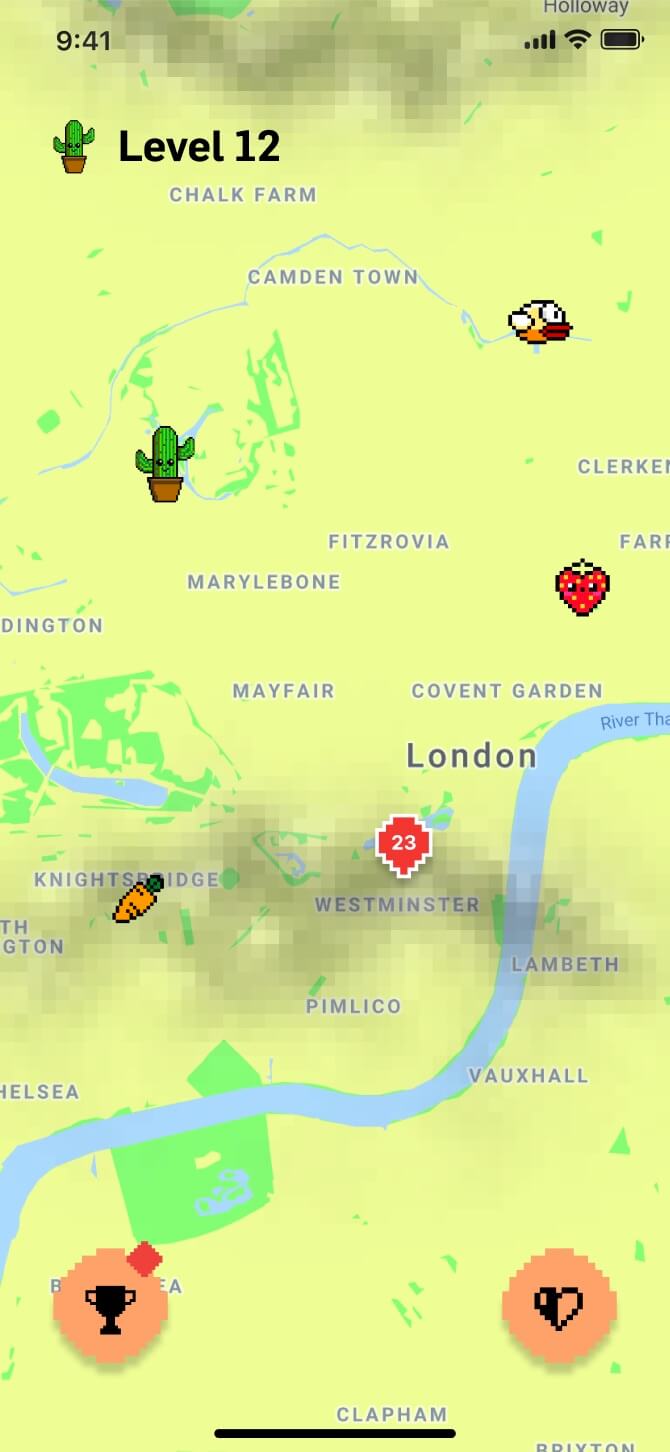
The app would open with this map visualising the progress of the user. Real time air pollution data would be mapped over and the current player (cactus) would move around from more to less polluted areas according to how well they are doing in the app. In this view they can also see other players in their real location to whom they can compare themselves, to hep provide better tailored suggestions.
I this initial feedback I was told the map not being geo location accurate just made the app feel broken. The app also needed more transparency in regards to the mechanism and data behind the suggestions for the user. Also an endless runner game as an alternative to the map.
Userflow
Below is a simplified user journey with real app screenshots for context.
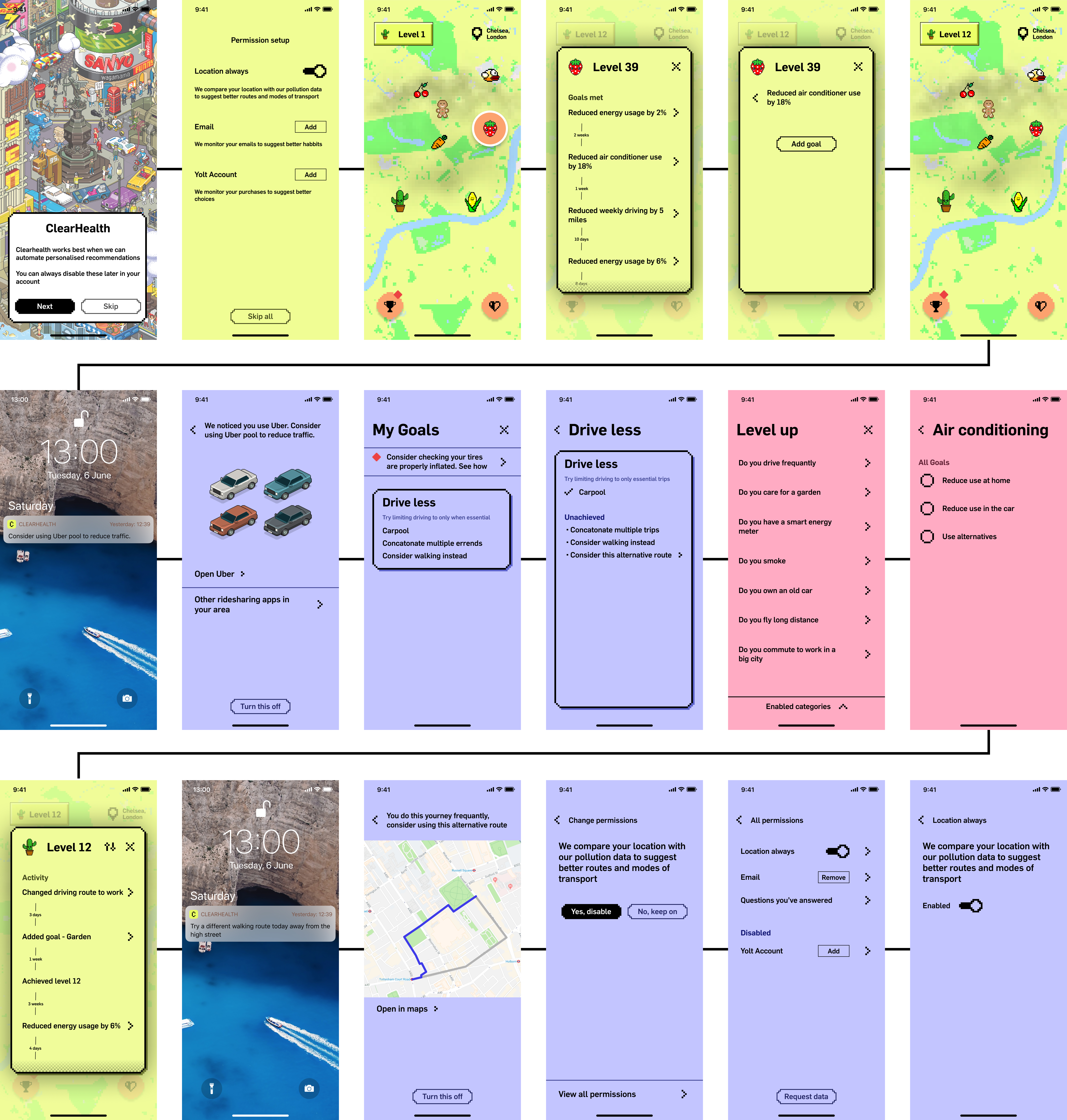
The first row takes the user through the permissions and map interface. Location can be used to track the location of the person to help with routing suggestions away from more polluted areas. This is both to help the users health and reduce the overall pollution in worse areas, such as more busy A roads.
The email permission, as Gmail does, allows the system to monitor habits by skimming emails and building a profile based an habits of the whole user base. And the Yolt account is one way of monitoring purchasing habits.
The main map interface is then presented with an orange tooltip to highlight the other local users. This way individuals can see other similar local anonymised uses up to 50 miles away to compare themselves to. When clicking on them they can then see their progress in the app and discover behaviour they can mimic as they are likely able to do existing in the same environment. Each of these goals can easily be added for the current user as shown in the 5th screen.
The primary app interaction is through the intelligent notifications. Once clicked and confirmed the goal category with specific goals is added with a checklist of goals. From the main screen the user can manually answer questions in the pink section to add these goals too.
Finally in the last row the user can continue to view their own progress history and access the specific permission that enabled a given suggestion.
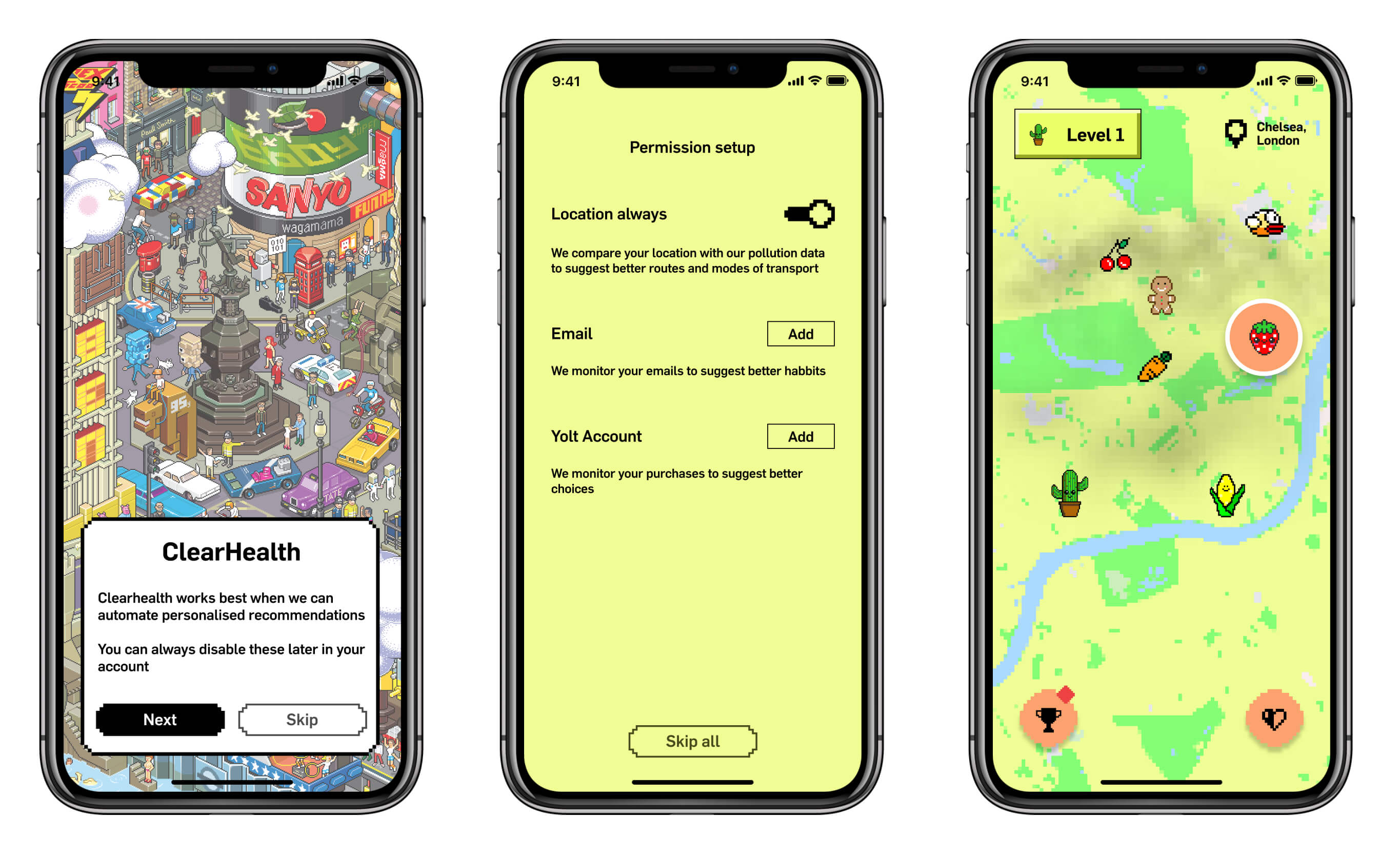
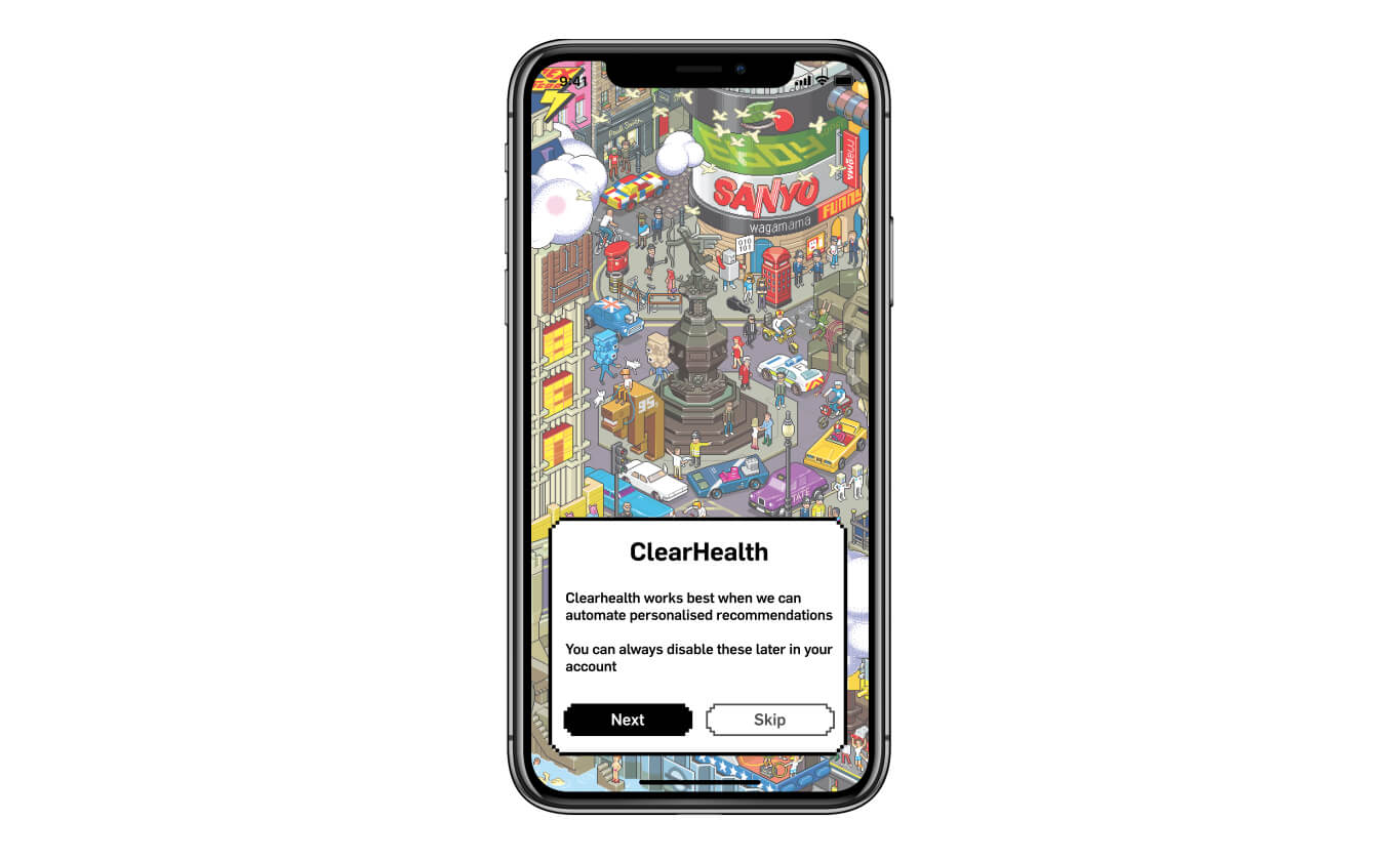
The onboarding first takes the user through the possible options at time of release to monitor them. Each with a small descriptor of what this will provide. None is necessary to use the app, through the lifetime of the user. The primary map interface assigns cute characters to each user. Each character represents a level to further gamify the experience. I chose to gameify the experience, use cute characters, pixel art and bright colours to mask over the dirty connotations we have with air pollution to provide a service that asks the user to do their small part to help make the world a better place rather than tell them its all terrible and demand they do something about it. This message is carried out through the notification frequency and the copy in the app.
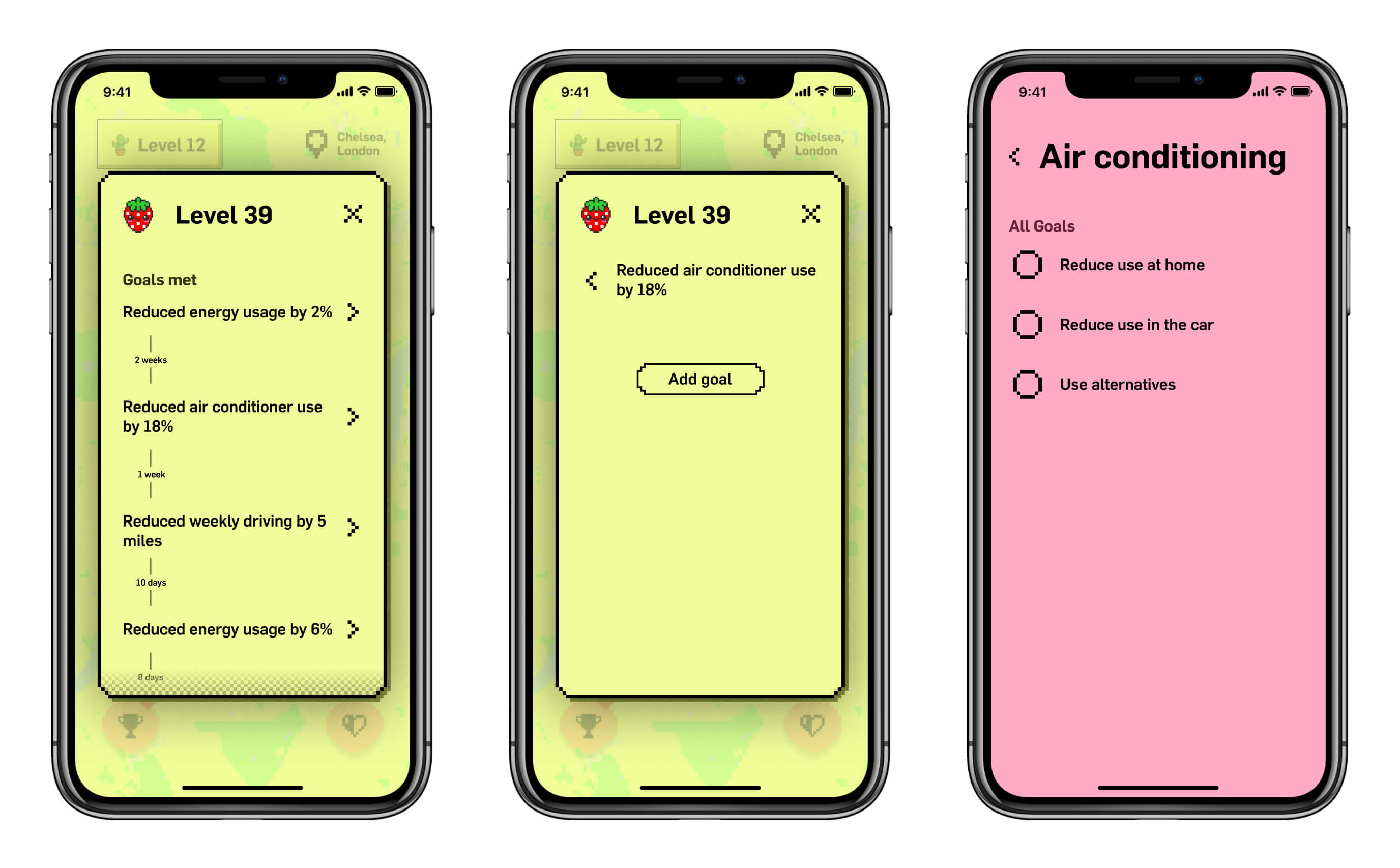
Above is the view when a user clicks on one of the other local player in the map view. In this screen they can compare themselves to others who are likely in relatable circumstances. The other players location is not exact but rather these other characters potter about the screen in the clickable area. This screen makes visible the time scales between the player hitting each goal. This further empathises the focus of the app and level up mechanism being focused on habit forming rather then the significance or quantity of goals hit. If the user feel one of the goals the other user has hit is something they can and are willing to do to, they can manually add the goal themselves here.
Automated labour
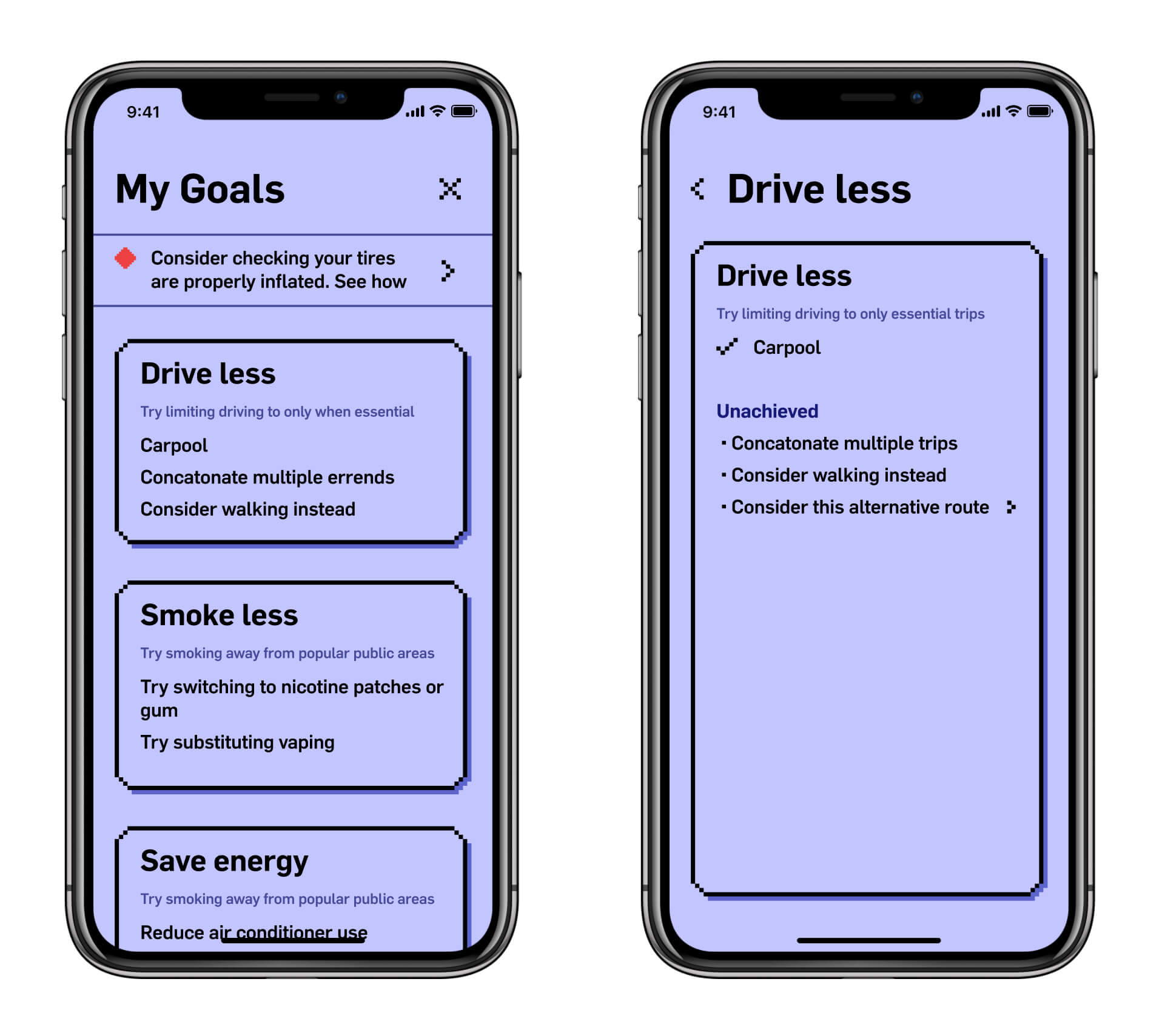
This is the core part of the experience, this holds the record of all the goals for the specific user. All specific goals are categorised into categories. This way The app can do a better job of providing recommendations for new goals. For instance, if the user has the car category enabled, we can assume we can trickle other goals in the car category to this user. From there on it acts as an automated todo checklist.
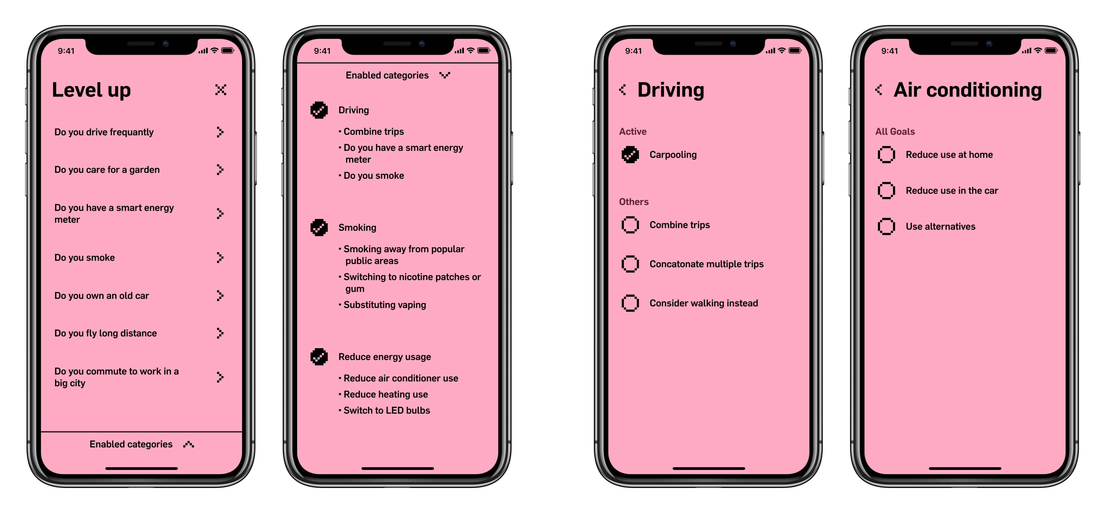
Should all other mechanisms fail or the user wants to add new goals manually, above is the manual level up views. This is structured in to questions to have a more natural language feel, like talking to a friend to help you. Each of the questions maps to a goals category like smoking or travel. In these the user can view the specific goals the app has not added already. This provides more transparency and freedom to the user. These lists would grow and become region specific in their hierarchy over time with more user data.
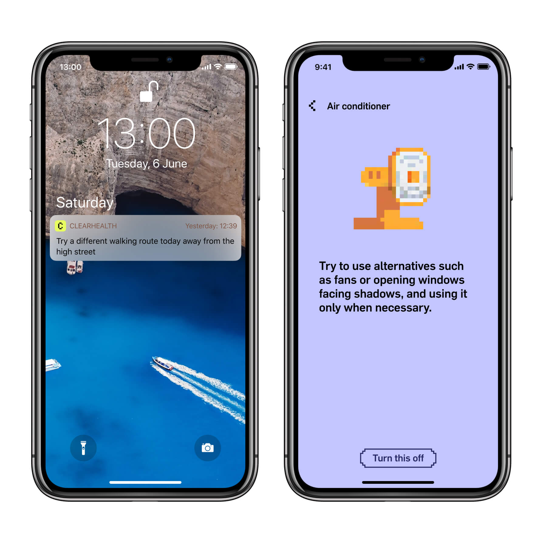
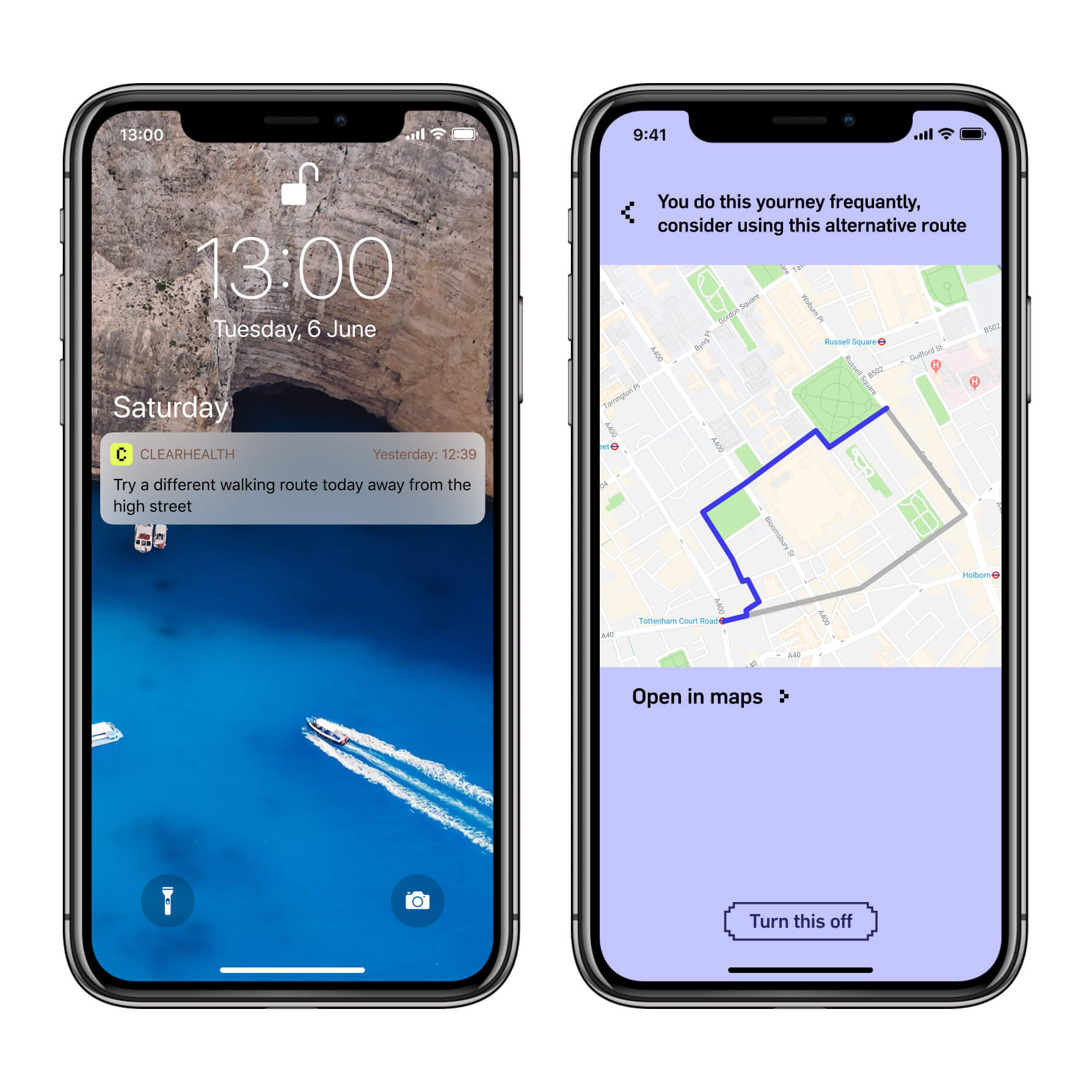
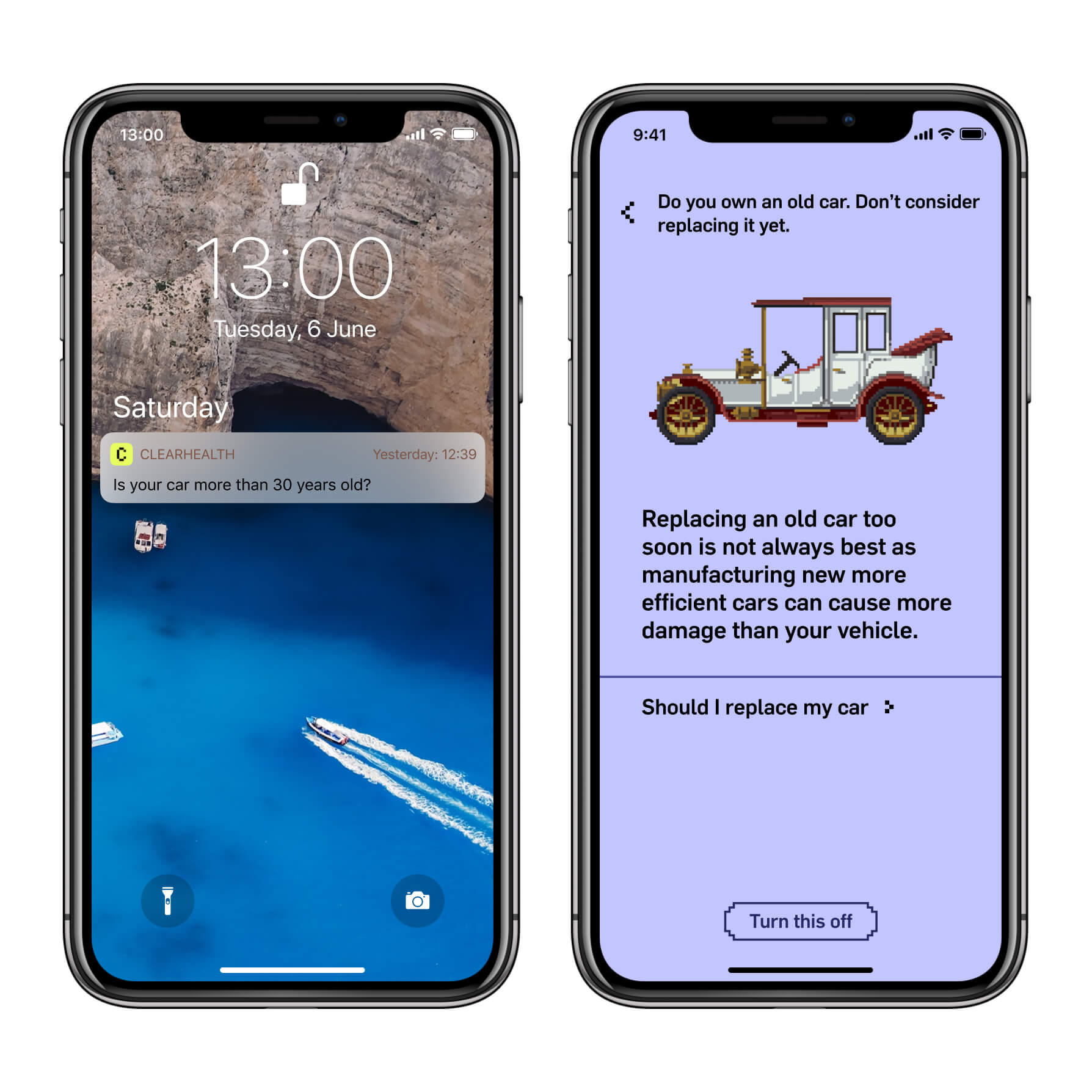
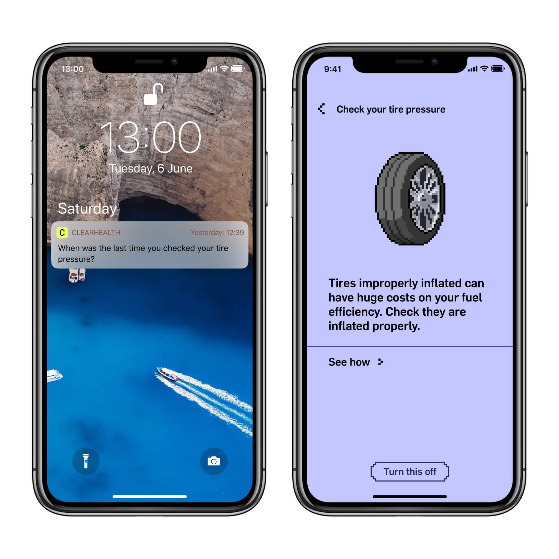
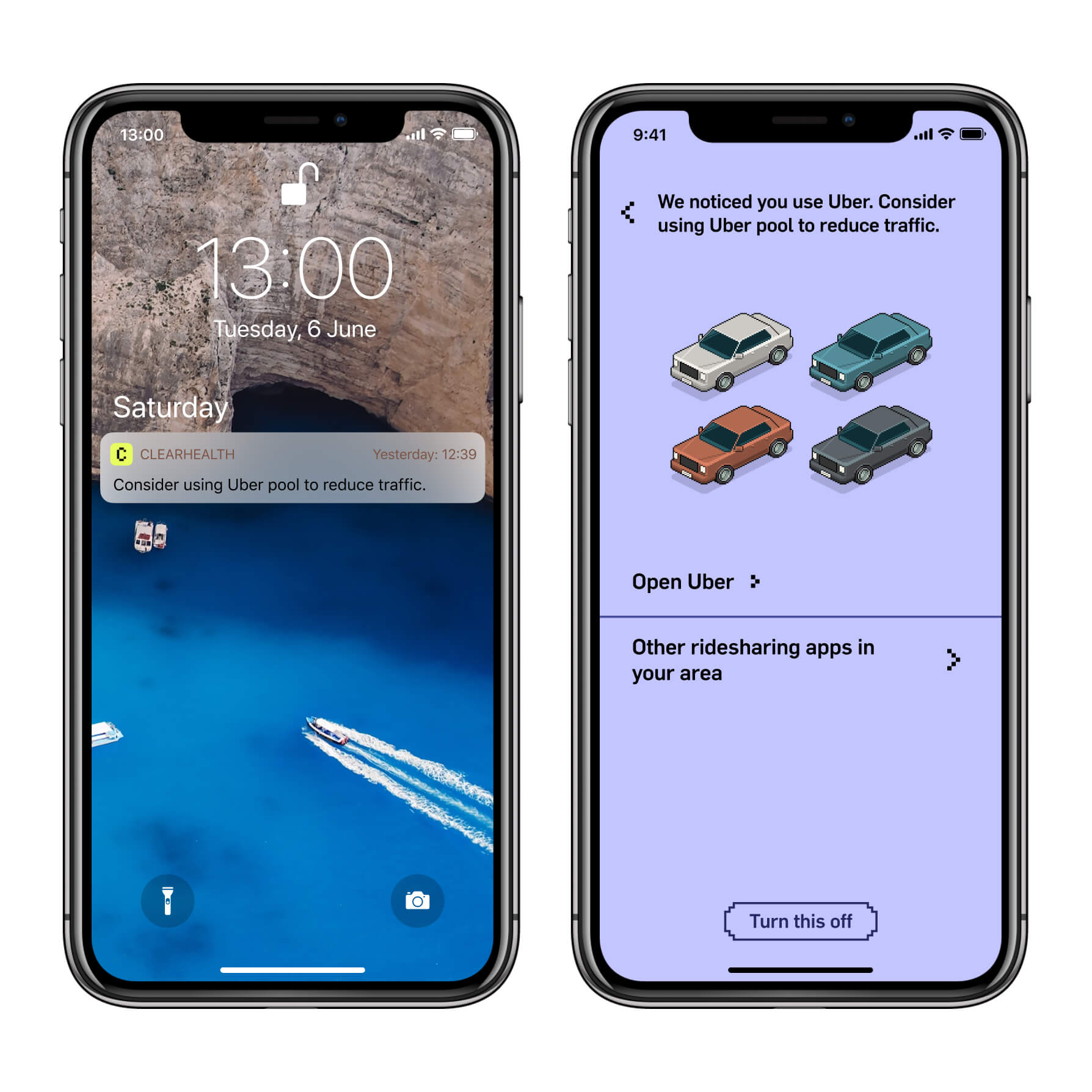
Above is a subset of what possible with the current number of permissions requested from users.
On the first particularly hot day of the year, suggesting using alternatives to air conditioning (not requiring any special permission)
The app can track your movement and speed and compare to local pollution data to suggest better alternatives for you and others around you.
The app can tackle common misconceptions by trying to pre-emptively prevent poor decisions like buying a new car too soon.
After knowing a certain user has a vehicle and tracking it frequency of use, can suggest when to maintain it such as inflated tires.
On Android, the app can monitor other apps usage to suggest better use of those apps.
Let’s talk privacy.
Invading the individuals privacy — no matter how transparent — is never the best thing to do. However, from a purely human-computer interaction perspective, having the individual manually assign and complete goals — which is the only viable, of a limited selection of alternatives — is far from an ideal user experience. People expect monotonous tasks to be automated as they should be, through the use of technology. Just because personal data is exploited so readily without remorse, so frequently, doesn’t meant this tool should be discarded.
Plus there is only so much we can stand to learn without levering big data, to then serve the people we gained the data from.
I have tried to make the permissions as transparent and simple as possible. There is no demand from the app to force the user to accept any of the permissions. Should this be the case, both fallback mechanisms will be the only mechanism for the app to function.
The app supports the users progress through three mechanisms, that follow a graceful degradation ideology.
Firstly machine intelligence is the ideal method to discover user behaviour and habits. This operated through the data gathered through enabled permissions.
Should this fail outright or sparsely return results, a notification query mechanism will come into play. This will ignorantly ask questions about the persons life like ownership of a car or flying for work. When answered yes can then add goals for the person.
Having both of these fail or rarely add new goals the user can manually add new goals by answering the questions themselves in the pink level up panel.
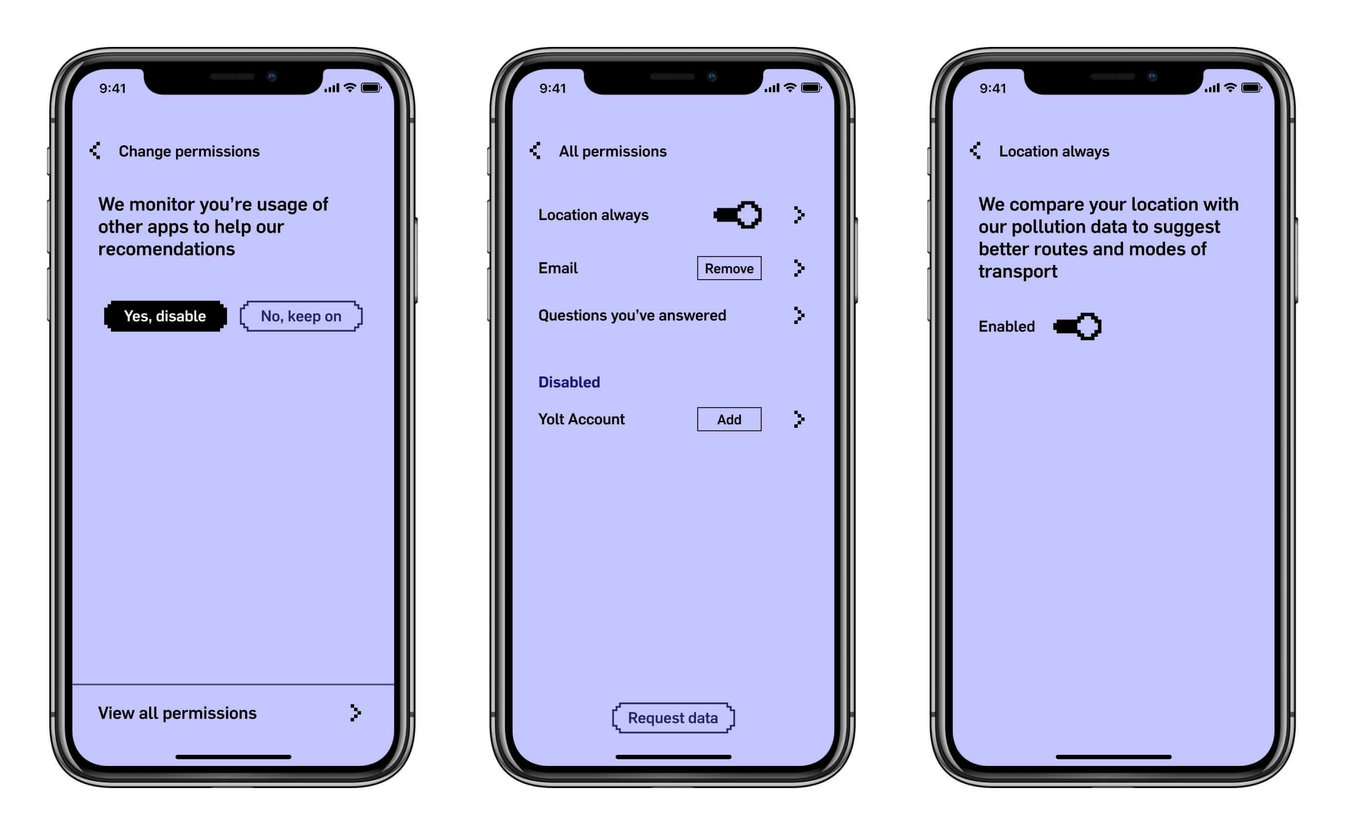
Each time a permission is successfully exploited and gives a suggestion to the user, the user is given an option at the bottom of the screen to disable the monitoring permission used to create the given suggestion. From here and in the user account settings the user can access and enable and disable all possible permissions.
In the final crit, the pixel art aesthetic received positive feedback however the project needed a better mechanism of explaining itself.
Concrete Data
Physical Data Visualisation
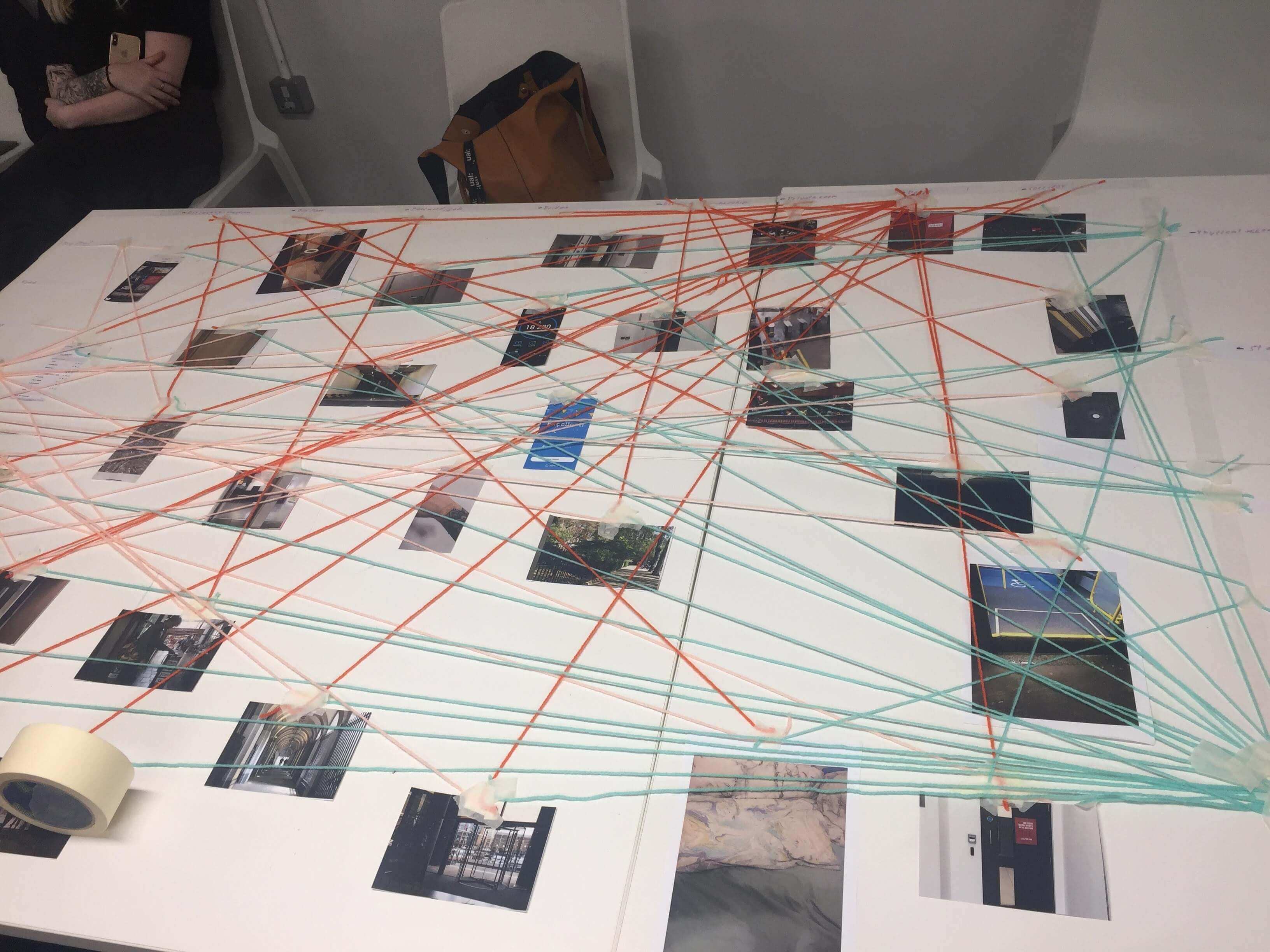
In this workshop, our group had predominately doors, and some other conceptual ideas of borers. One border I brought in was that between consciousness and unconsciousness when we fall asleep illustrated with a picture of a pillow.
Another border that has recently gained prominence is the issue of how social media platforms treat their users when they die. Fast Company said wrote about a study that finds by 2050 Facebook will have more dead users.
Super stoked with how this turned out pic.twitter.com/UCxpMeD0V2
— Bryan Liston (@listonb) May 6, 2019
This workshop reminded me of a tweet I saw recently of similar exercise at a Microsoft developer conference where over a couple of days it begun to clearly visualise the habits and differences in work-flows of the attendees.
Concept
I want to communicate the story of current China-Africa infrastructure projects and show how its not as simple as China being a loan shark. This will ultimately be a speculation based on historical events and current tensions.
Bloomberg made an attempt to visualise the extent of Chinese Industrial influence in Europe, something much overlooked ad China’s controversies are usually more closer to home or more recently in the US trade war.
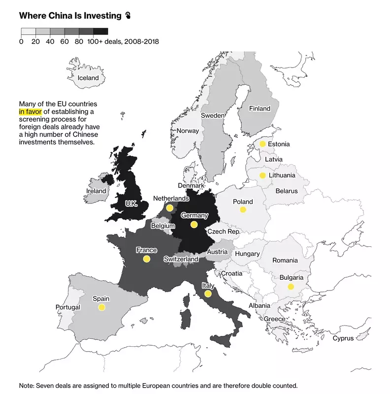
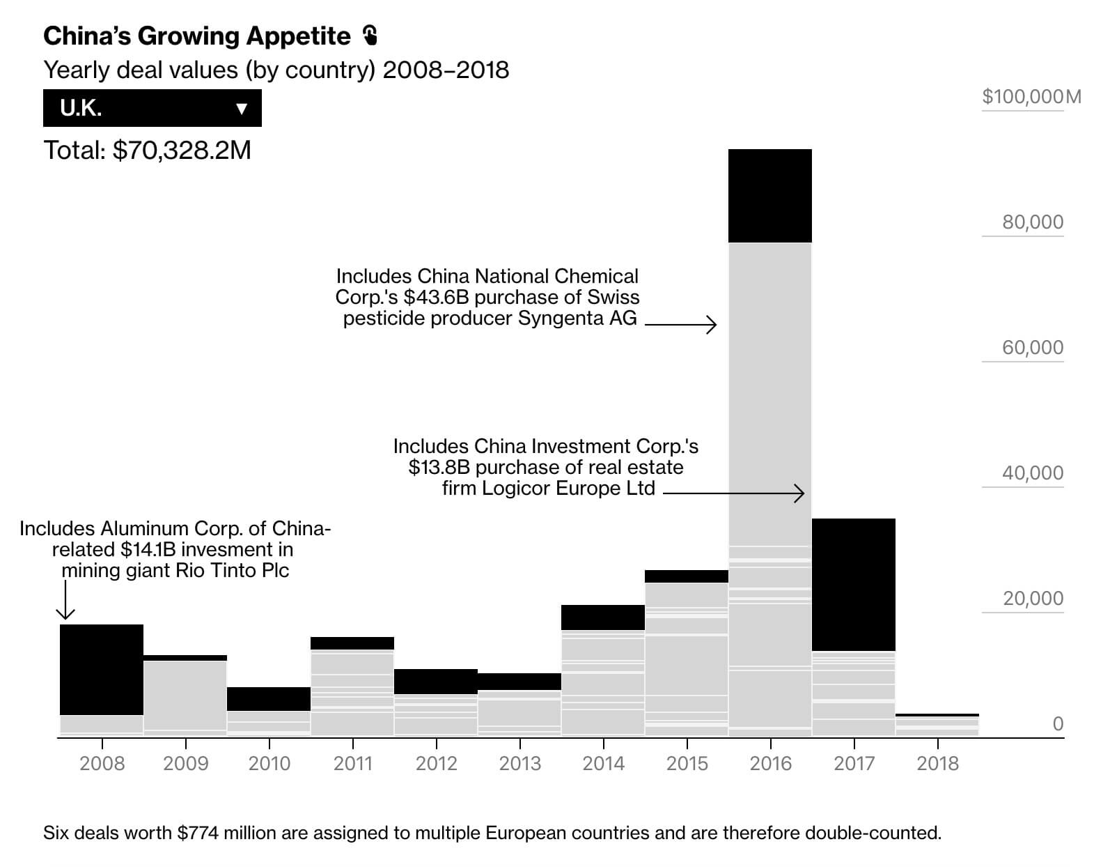
This article has a series of interactive visualisations all similar to the two pictured above. They all have a pattern of hidden UI with invisible interaction, and an almost absent use of colour to help. Also they don’t help compare the data, In the second image they have a drop down with all the countries. I feel this all comes form their need to how too much information in the visualisations. Not the Mona Chalabi approach of just drawing the data in context.
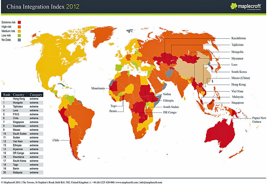
You can see the broader extent of this influence in this diagram. As you can see Europe is far from the main priority for China or have failed to make ground here.
This more interactive visualisation shows US drone strokes over time and the group of people affected, with the coloured dots beneath the line. This also specifically highlights Obama and the affect he had (17s into video). The temporal aspect to this, strongly linked to the subject matter, creates an ominous feeling to the project. Something I will consider doing in this project.
After the first interim feedback sessions, Oliver put me onto special economic zones as a broader content for this projects. These zones illustrate a confession by the nation states that their enforced practice may hinder their ability to grow. Such as communist China, bending to capitalism in Shenzhen and Guangdong.
I feel that these are more short term solutions and the longer therm plans China has are of greater prescience so I took the project in that direction. Especially as in the west we often ignore the rest of the world until they affect us negatively.
On the topic of special economic zones, The pudding has a similar article to Bloomberg about Europe, but I feel does a much better job. They simplify and put content in-line with visualisations to help make a step-by-step walk-through user experience. This is the only interactive element of the article, and it too had tooltips on the visualisation, however, thanks the structure of the content itself, it it not necessary to reading the visualisation. It is an added step in the progressive disclosure of content should the user want to see it.
This film illustrates the reality of Chinese engineering companies in the Republic of Congo. It illustrates the tensions between cultures, language and socio-economic revelry.
Interactive Narrative
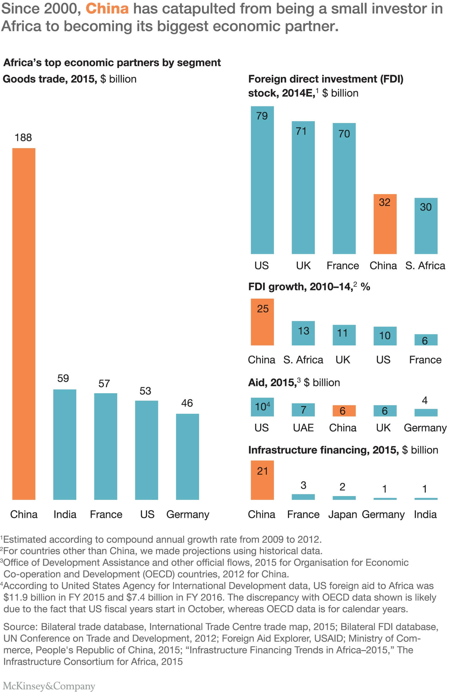
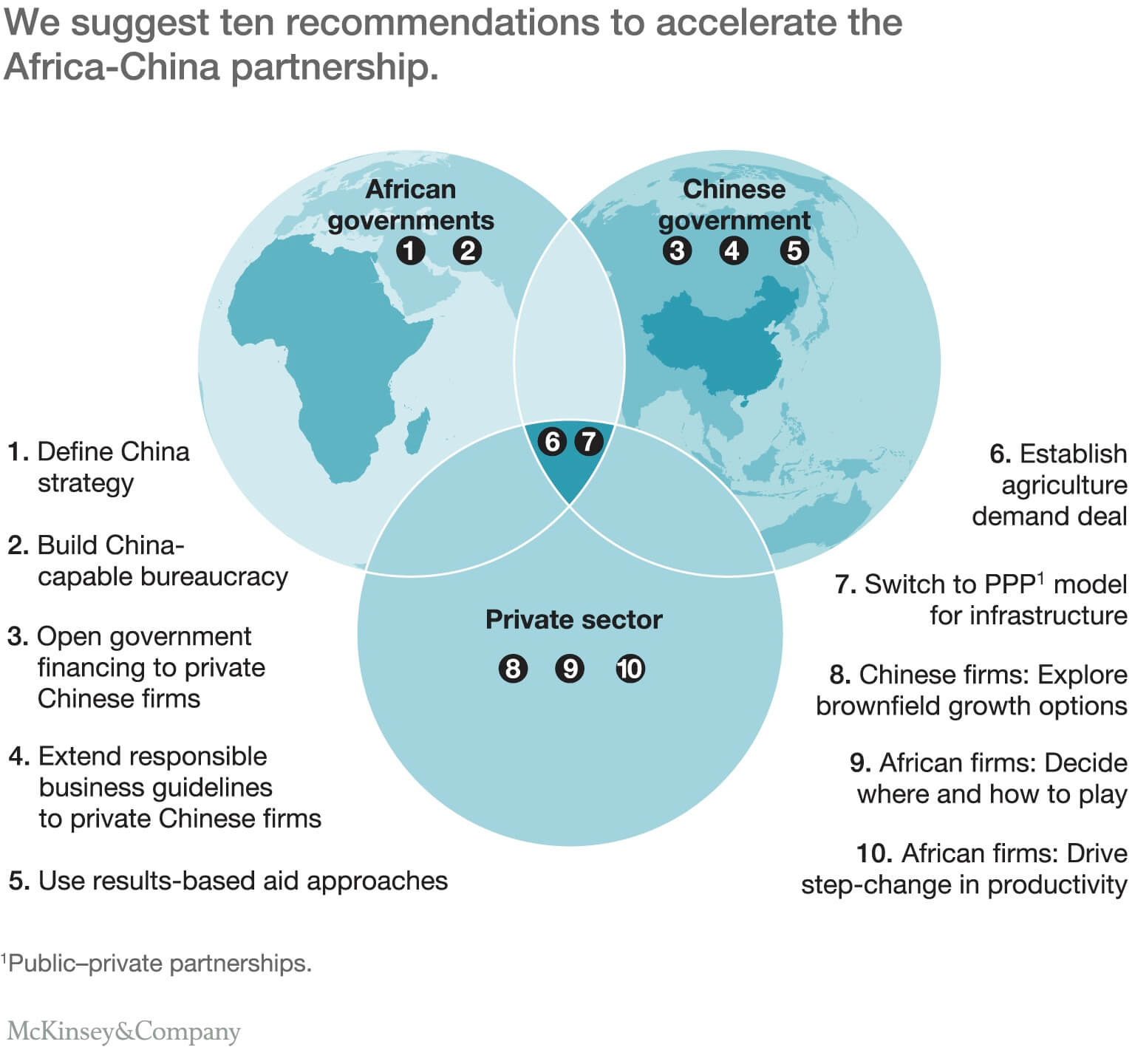
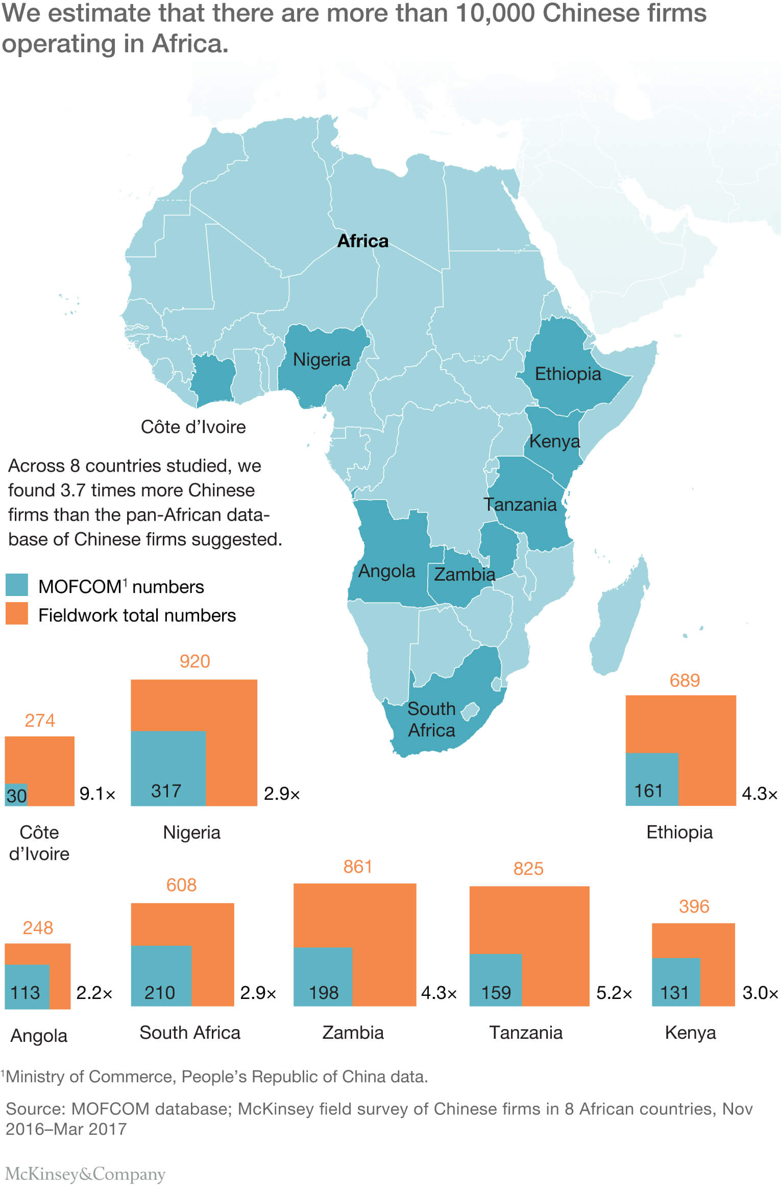
McKinsey has a fantastic breakdown of the China-Africa relations, an assessment of the present state and future plane of the republic. These are all clear but fairly simplistic visualisations. I aim to take this data an inject a more story telling element to them.
One thing I really appreciate by McKinsey is they are not beating the negative narrative around China, but are pro actively seeking to help the situation as evidenced in the second image.
I am planning on telling the story as a chronological narrative, this would include fixed position stats in form of text or bar chart for instance showing changing factors over time such as GDP. Similar to how Bloomberg illustrated the back and for the in the US-China trade way with boxing style round scores
I want to make an interactive visual essay/article as this is the perfect medium for telling stories through data.


Recently there has been a surge in traditional media making more visual and interactive conetent on their digital platforms. Some more dedicated a better like The Pudding and NYT Brand Studio and others like CNN Editions and The Guardian. This comes across as a maturity of the web as a platform. When graphic deign peaked in custom content on every page, it out-shined the put-your-content-in-our-box model of the web. The web now has custom interactive content to suit its medium.
In the above examples, some of them are always on brand like The Guardian while some are tailored in content like the Pudding. Though the have some consistency like floating centred text boxed above content as you scroll.
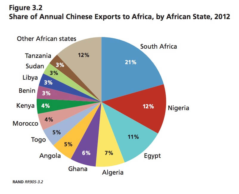
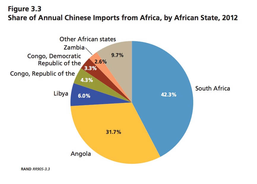
As expected Chinese exports to Africa vastly outweigh imports in general. However, Chinese exports to Angola amounted to US$1.68 billion and Angolan exports to China amounted to US$13.97 billion with their biggest export being Crude Petroleum. Also interesting to see Nigeria (alongside South Africa), one of China’s bigger alleys not listed as one of the bigger exporters, while the republic of Congo is.
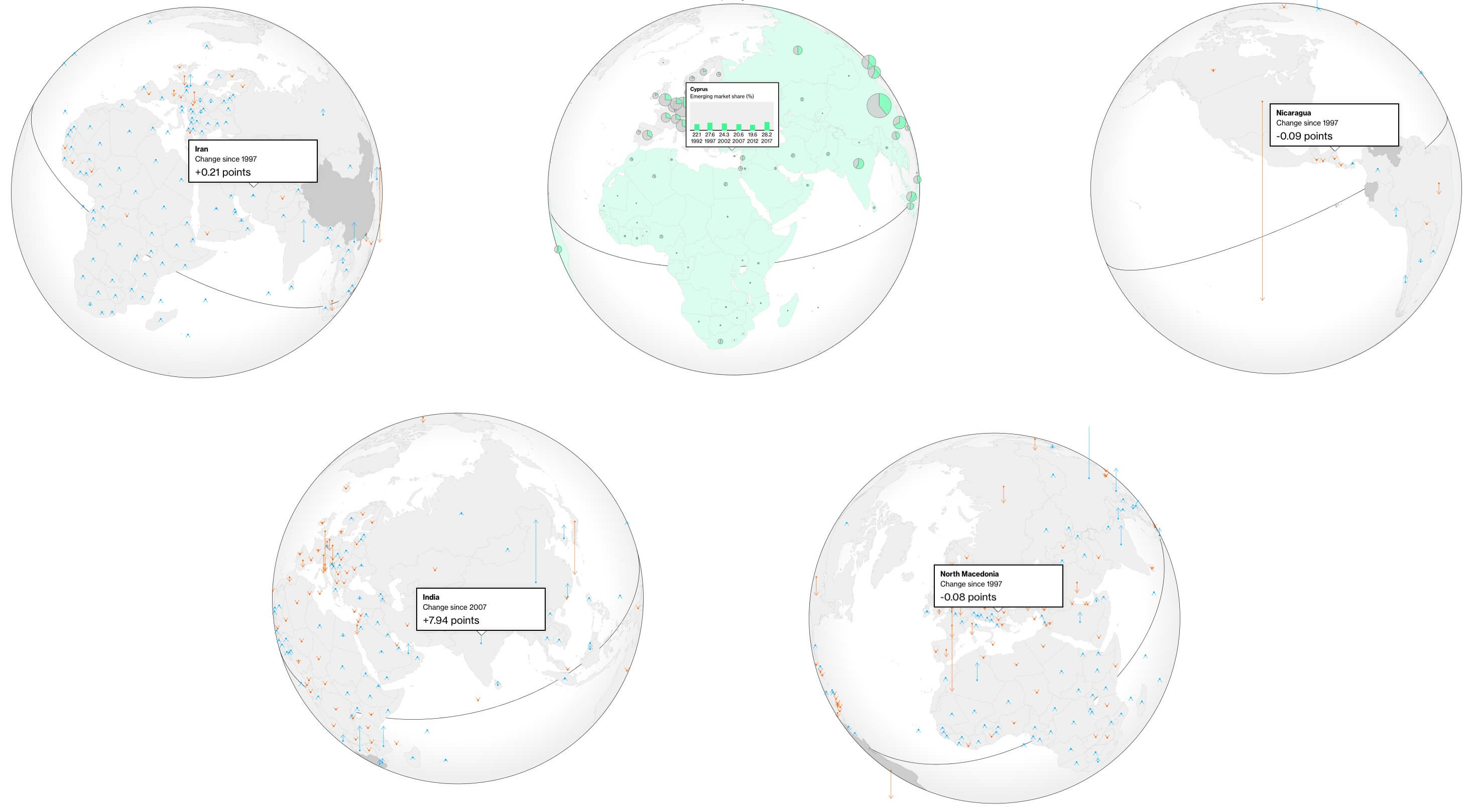
On the topic of global trade, traditional media outlets have a tendency to use big animated or illustrated globes to plot the data onto. Above are all different interactive globes in the same article. I provides a consistency but also a bit of a cop-out in respect to data visualisation. They make the user hunt for the information rather than naturally providing the story.
In contrast this article from the NYT, under the headline they provide buttons to read the article in both traditional and simplified Chinese, a really cool idea to increase the demographic for the article, especially for the people its about. They articulate the the extent China’s infrastructure in Cambodia through aerial photography that animates to red dots to convey the number of projects. It has a consistency that I am trying to aim for in my project.
Both Wendover and Rare Earth have used the phrase China’s China in respect to China-Africa relationship. They see China as taking ownership of Africa. They talk about the integration of the cultures, or lack thereof, and the existing examples of previous deals gone wrong.
It will be interesting to see how they act if they to try to take control of more territories or businesses to regain their loans, and balance their cry baby tendency when the west attacks them. An example of which is the current trade war where China retaliates to the US banning one Chinese company, while China basically bans all US companies.
Animated Narrative
In my readings I found, in an attempt to help Africa, the US and EU have given them free exports to these economic regions, with specific exception to foreign direct investment — what China is doing. So this seems not to benefit China’s global trade, however, if the debt-trap works, they could gain part or full ownership over local business and gain this benefit.
The US provides tariff free exports under the African Growth and Opportunity Act, and to the EU under the Everything But Arms agreement. FT
I put some images to show how life is really like there, but I never ended up using images further down the article, so I removed this. Also quite jarring on larger monitors These would have shows a realistic summary, similar to the NYT article, with deeper explications through the article.
The first visualisation in the article shows what is the intuitive explication for China’s actions. Its hows stagnating economic growth after an explosive rise before and the state of Chinas middle class. Though some still consider China to still be a third world country, China has a very large, very wealthy population. I layered and animated these two data points to help break down the narrative and provide a moment for the user to contemplate.
As shown this article from the Telegraph the growth of education has been rapid between 1999–2013, African slum population has been down for all but the south and city population growth has been on the rise too. So though China sees Africa as a growth opportunity, it may not be so for long.
In response to how I perceived the Bloomberg globes and NYT areal photography I brought up earlier, I made my main visualisation animate with the natural flow of the page. The user is already scrolling, and as such no change in interaction needs to happen to convey the narrative. As expected through the years the continent becomes more opaque. The dataset I used included both positive Foreign Direct Investment (FDI), as expected, however, it also included negative. Only explained the the source Chinese white paper as a balance of trade. Thus all I can conclude is the the negative FDI, shown in red in the visualisation, is the total flow of cash out the country is greater the that going in. But this is still reflected in China only FDI. Nonetheless, it thankfully provides a more well rounded picture of the state of affairs across the continent.
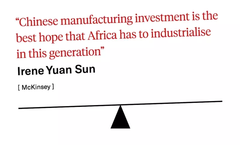
This quote is from an FT article breaking the narrative about China. Though this quote is unequivocally not true as it is a prediction about the future, it’s a really important perspective reader needs to know about — regardless of their response. Because I want the reader to both make up their own mind on this grey area and convey this is not a black and white issue, I have put this quote on a see-saw.
In the following paragraph I say African nations involved in the new belt and road project are not passive victims. This is decidedly provocative to counter the popular narrative to ignore this part of the story. They are aware of the role China plays globally and historically, and the tactics of Chinas rivals. They know far more than the west about how they should progress their own country and its not the role of the west to tell them what to to.
By no stretch of the imagination is modern China innocent, however, it needs to be noted in the grander scheme of global affairs, they are, specifically in the Africa example, are taking a less hostile approach to foreign diplomatic affairs than their counterparts. This has to be respected along with the choices of the partner nation states.
My dashed line
For all the sections in the article I have included a link to the source to be as transparent as possible. This also provides reader with a opportunity to learn more from a variety of sources.
To help illustrate the truth around the rail projects in Africa, I made this widget to compare different stats about the 5 most recent China built projects by the CCECC.
What surprising is all the rail projects are either passenger only or passenger and freight lines. By running passenger trains, they are directly helping the local people and economy, rather than only benefiting their trade routes. Almost feels philanthropic.
In the final section I have three highlights representing Africa, China and the US (in that order). When the user hovers on these, I reveal some information corresponding to the sentiment of the highlighted text.
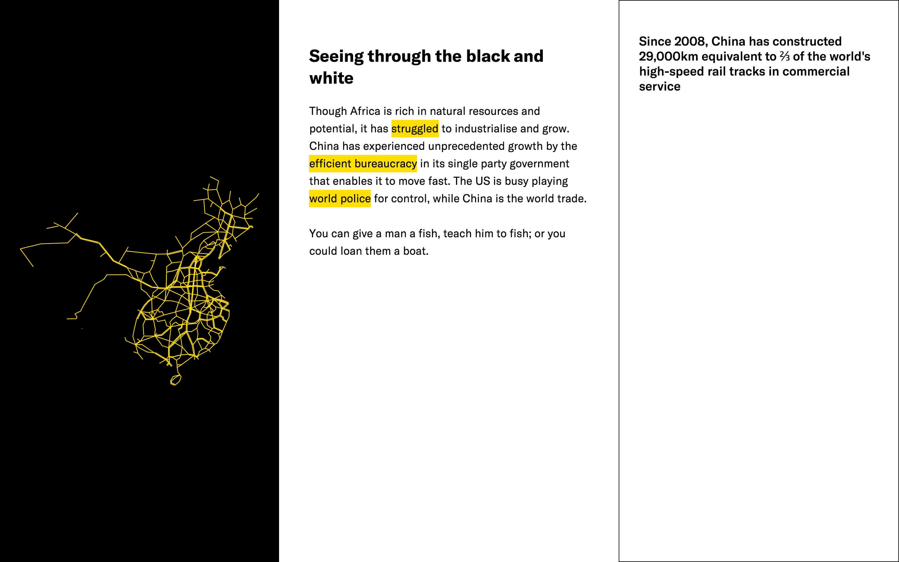
Under the Chinese highlight, efficient bureaucracy, I show a prevalent example of this. China is especially good a building railways. The exact dates of the construction of the modern high speed lined is fuzzy, but it’s all in the last 2 decades.
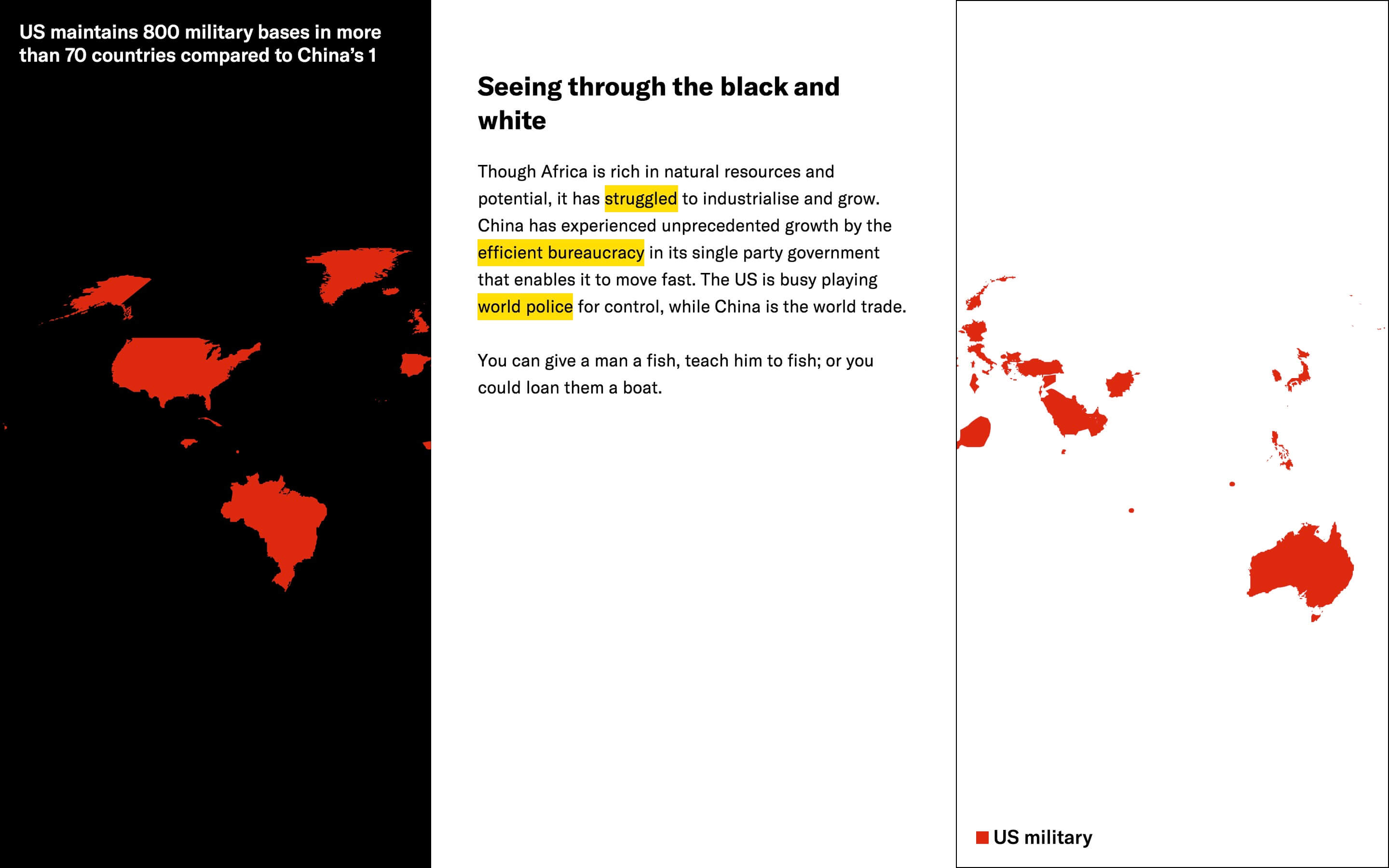
To show contrast with China’s rival, usual practice under world police, I show the vast land on earth the single country of the US has military bases in. Somewhat invasive over-protectionist move. While they have thee basis, in many cases they often do nothing, as is the case with the 9 dashed line.
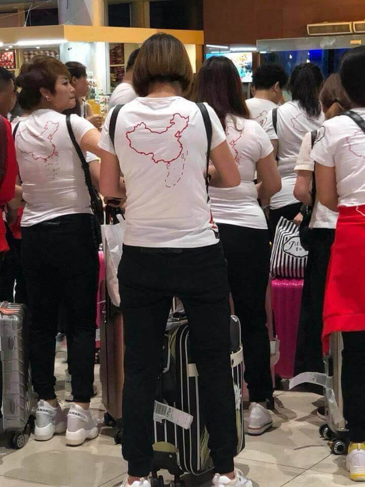
While the US is busy trying to defend freedom overseas, China has a similar objective more close to home. They have already has disputed territories in Tibet, Mongolia, Hong Kong, Macau and Taiwan, and now they are trying to increase their home turf into the South China Sea.
Pictured in the image above was a case of a group of Chinese women who went to Vietnam wearing these provocative t-shirts showing the so called 9 dash line image.
Vox have a really good video on this topic with a similar aesthetic to the NTY article from earlier. Explaining that China believe they have a historical right to this area of sea, and how they are building islands and claiming them as their sovereign land to claim the major shipping passage. Also attempts to starve Vietnamese islands in this area.
To conclude the simplified conclusion, the last line says You can give a man a fish, teach him to fish; or you could loan them a boat which is to broadly suggest the west had been mostly giving and some teaching of fish with significant but still little help, whereas China is empowering them with a low interest boat.
